Best Dark Mode Dashboard Designs for 2026: 22 Real Screenshots
22 real dark mode dashboard screenshots plus live clips: e-commerce admin, fintech and SaaS, in dark and light, with the surface scale, contrast and chart palette behind them.

Twenty two real dashboard screens and four live clips, captured from working products rather than mockups, with the surface scale, contrast ratios and chart palette behind them written out below.
Dark mode stopped being a preference toggle a while ago. For dashboards it is now the default: analysts keep them open for hours, traders watch them overnight, and OLED screens made deep surfaces feel native rather than dimmed. But most dark dashboards are still light dashboards with the colors flipped, and that is exactly what makes them hard to read.
This guide is both a gallery and a spec. Each section shows real screens from one vertical, then names the decisions behind them, with concrete values you can paste into a config file.
What separates a real dark mode dashboard from an inverted light one
Inverting a light theme produces pure white text on pure black cards, high-glare accents and invisible gridlines. A designed dark dashboard rests on five decisions.
- A surface scale, not one black. A near-black page background such as
#0B0E13, cards raised to#11151C, hover states at#171C24. On dark themes elevation is communicated by lighter surfaces, not by shadows, which disappear on dark backgrounds anyway. - Off-white text. Pure
#FFFFFFon near-black halos on OLED panels. Something like#E6E8EBfor primary text and#9AA3AEfor secondary keeps long sessions comfortable while staying above the WCAG 4.5:1 ratio for body copy. - Desaturated accents. Brand and status colors tuned for white backgrounds glow on dark ones. Pulling saturation down slightly and lightness up keeps the hue recognizable without the neon effect.
- Chart-specific contrast. Gridlines at low opacity (white at 6 to 8 percent), series colors at least 3:1 against the card surface, tooltips on the elevated surface so they read as above the chart.
- Tabular numerals. Any column of money or metrics needs lining, tabular figures so digits align and comparisons scan vertically. Dark interfaces forgive misalignment less, because there is less visual structure around the numbers.
E-commerce admin dashboard designs
Store dashboards mix money, inventory and imagery, which makes them a hybrid of the fintech and SaaS rules and the hardest of the three to keep calm.
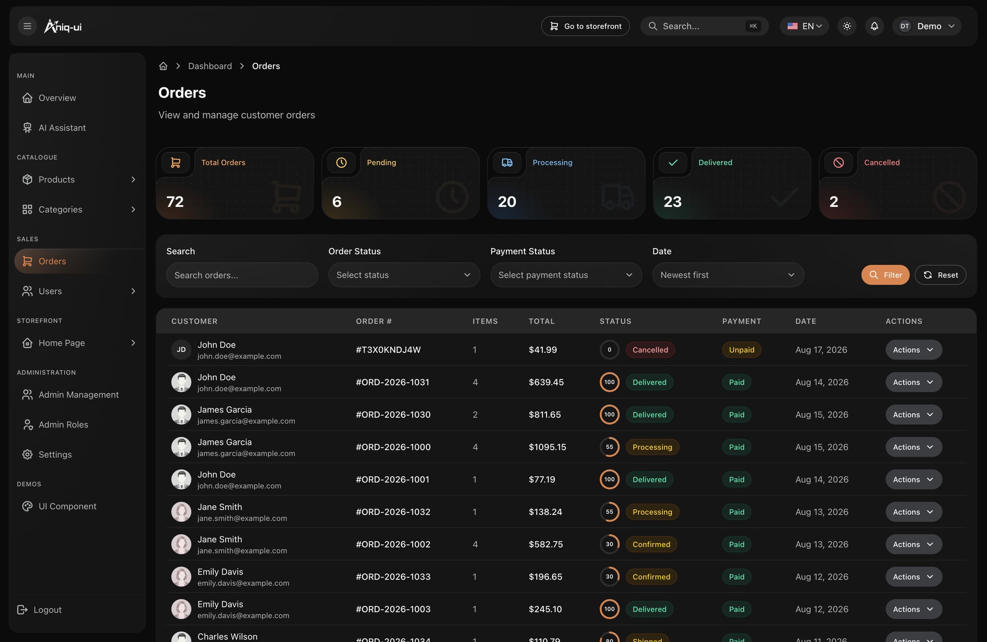
Orders: state as tinted chips
Two independent facts get two chips, so nobody has to guess whether the money arrived. Stat tiles sit above the table, which means the shape of the day is readable before anyone scans a single row.
- Order state and payment state never share a label
- A fulfilment ring on every row instead of a percentage column
- Filters recessed to the page surface, table raised, so the eye lands on the data
- One chip vocabulary reused on the customer's own tracking page
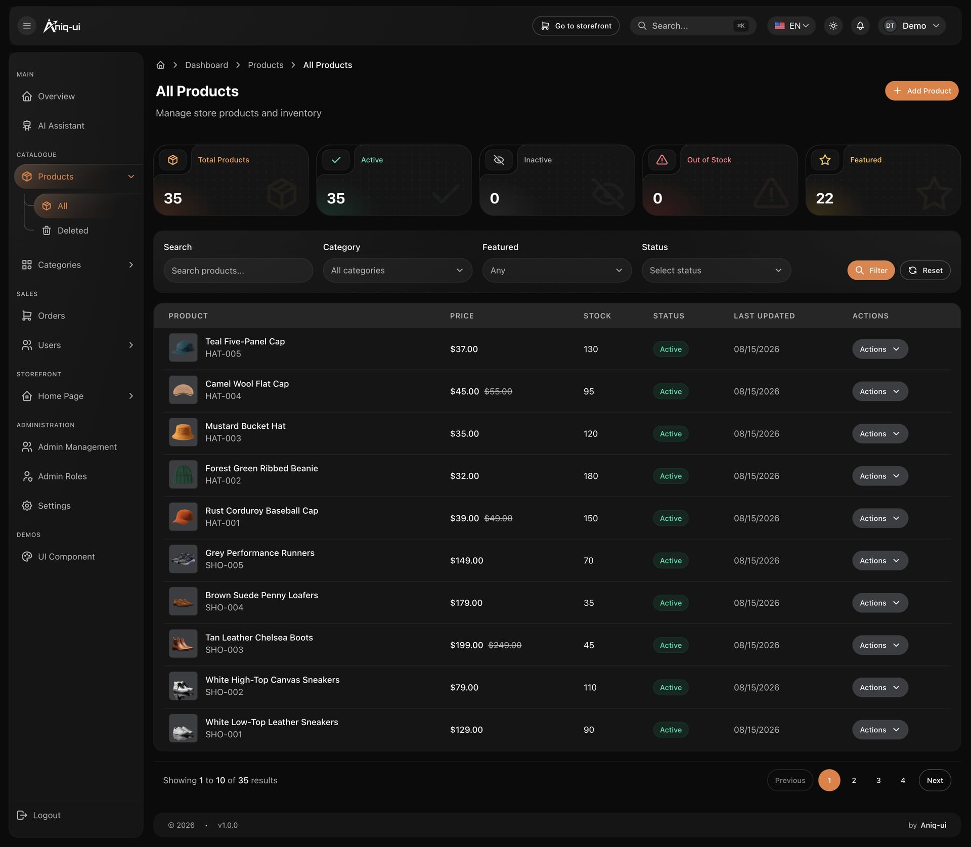
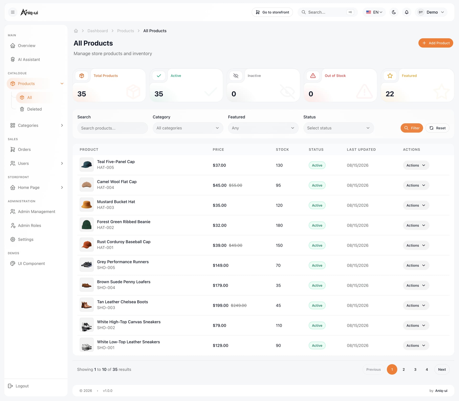
Product thumbnails are where dark store dashboards fail. Photography arrives on every background imaginable, so each thumbnail needs a fixed tile fill and a fixed aspect ratio. Without it a white packshot burns a hole in the table and the row grid stops reading as a grid.
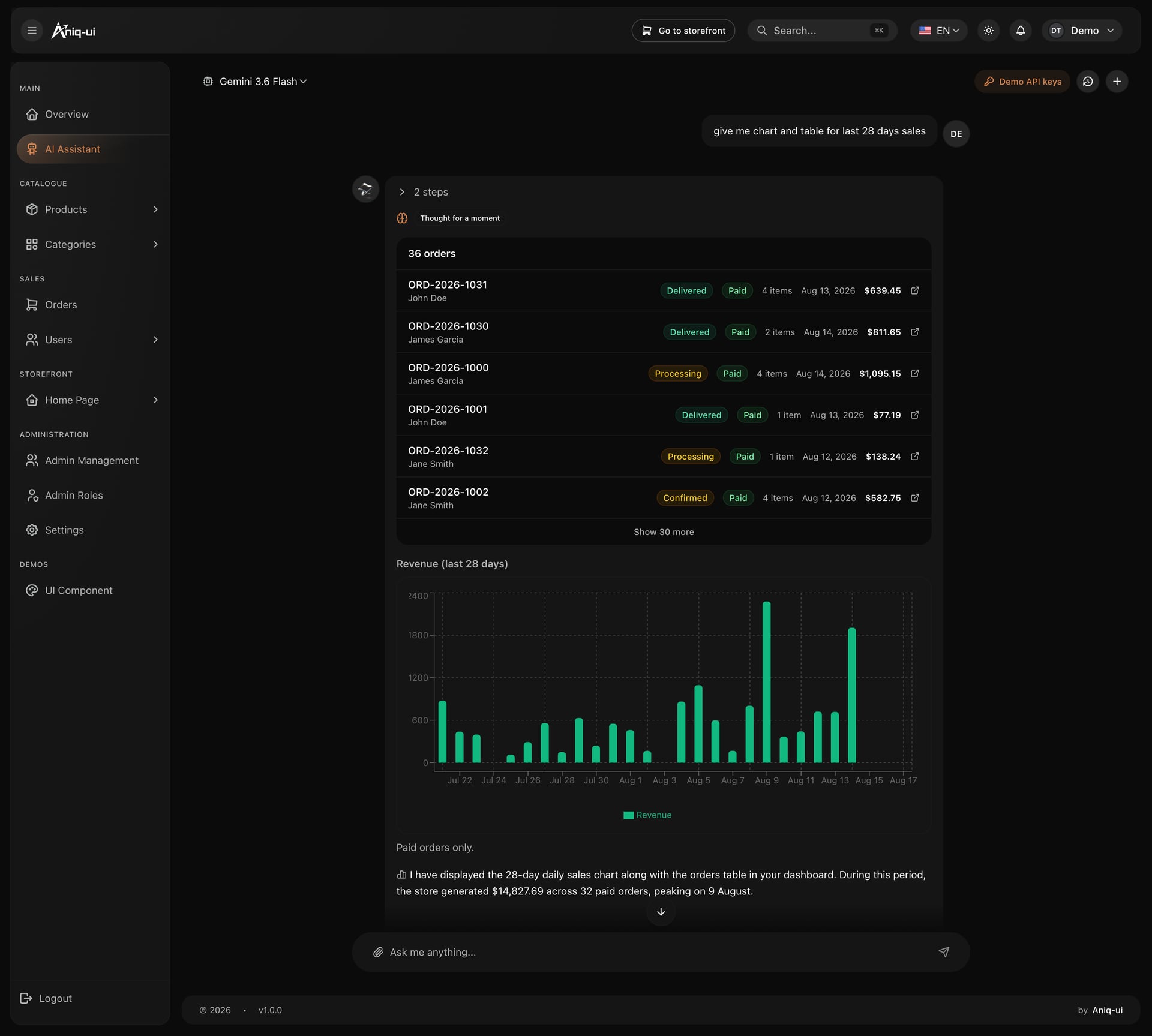
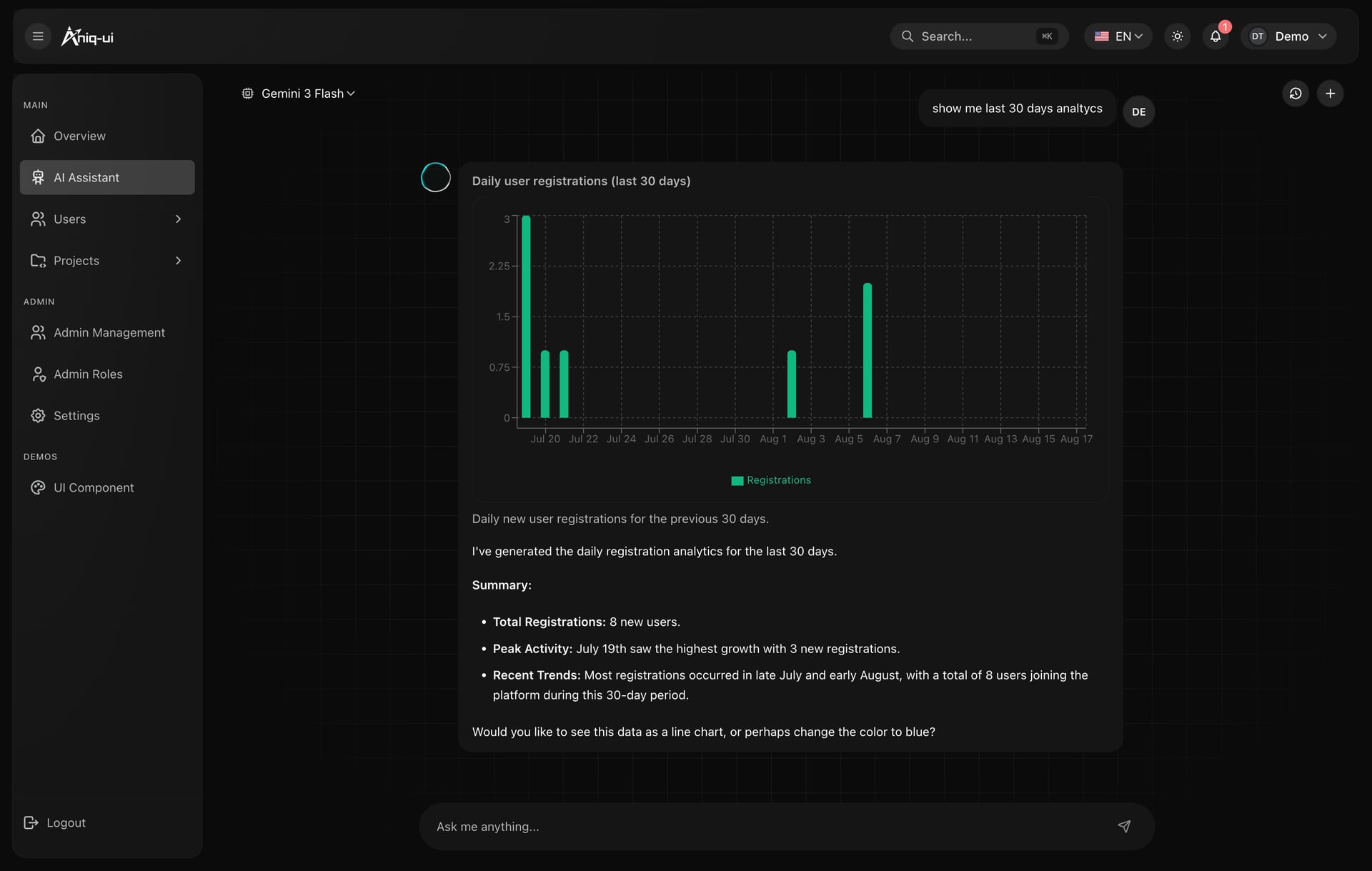
An assistant that answers with the store's own numbers
Charts generated inside the conversation follow the same palette as the rest of the product, so an answer looks like part of the dashboard rather than a screenshot pasted into a chat.
- Live orders table and a daily revenue chart in one reply
- Series color at moderate saturation, gridlines at 6 percent white
- The written total under the chart, for the reader who does not want to count bars
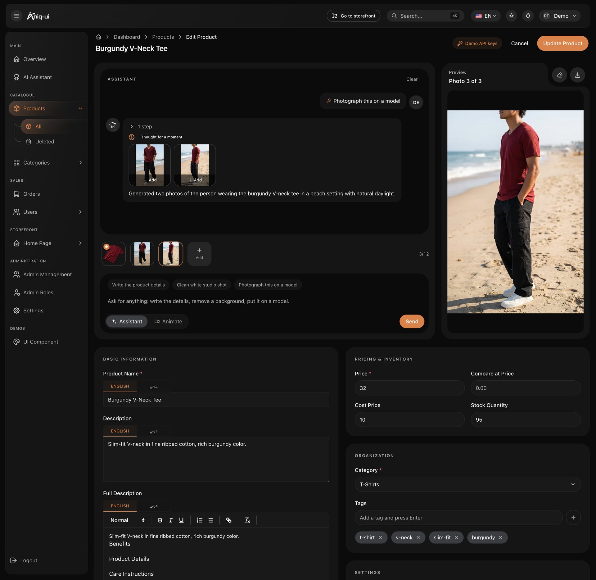
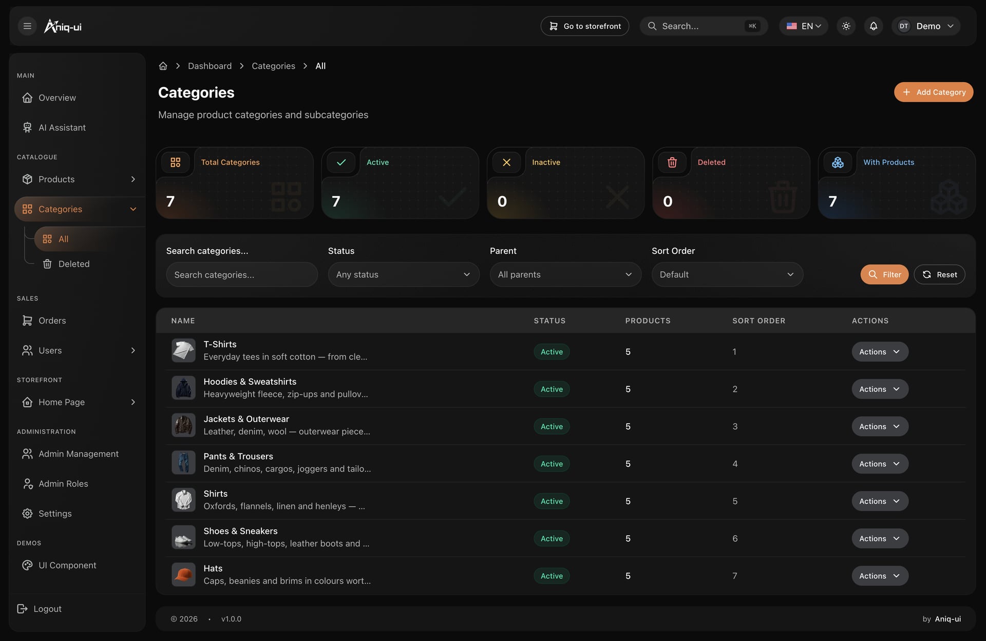
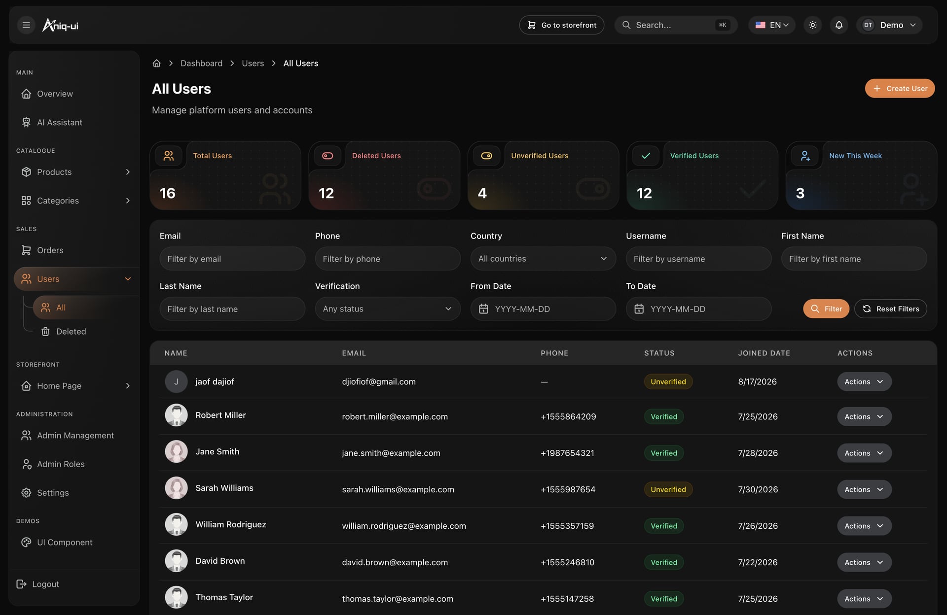
All of these screens come from the Next.js e-commerce template with admin dashboard, which pairs this back office with the storefront it manages, in English and Arabic with full RTL.
Fintech and banking dashboard designs
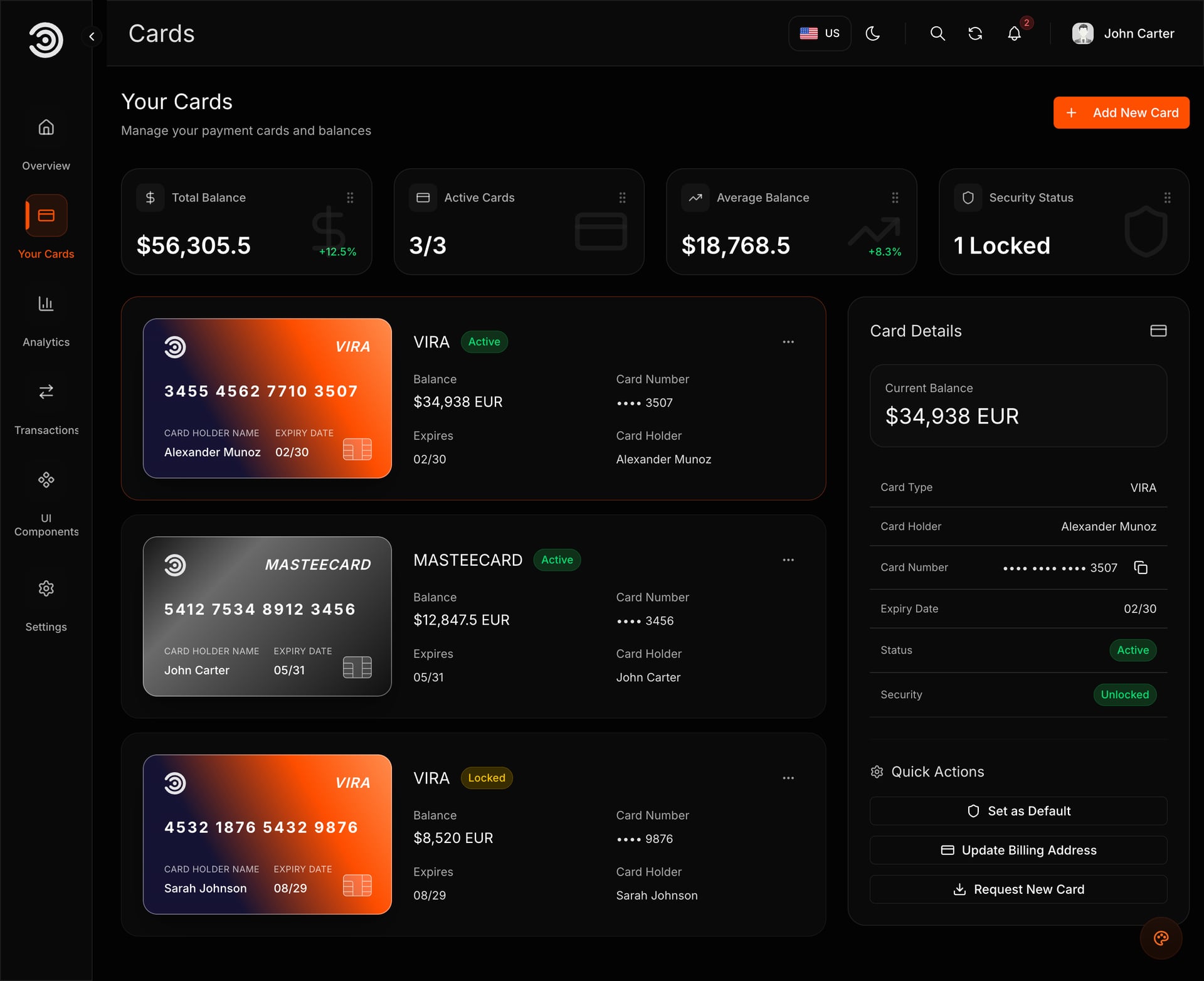
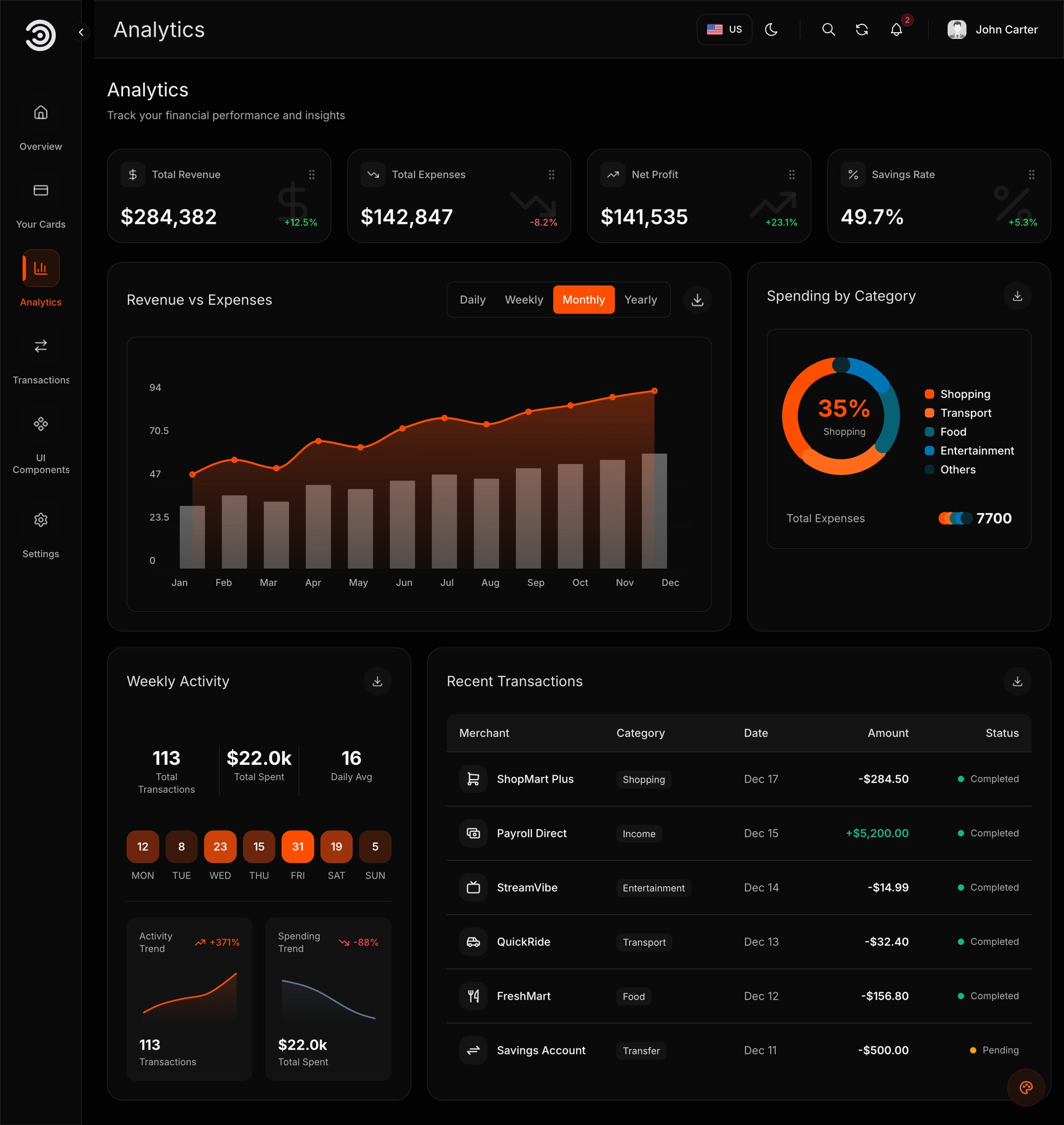
Financial dashboards carry the strictest requirements: dense tables, profit and loss semantics, and an audience that reads them all day.
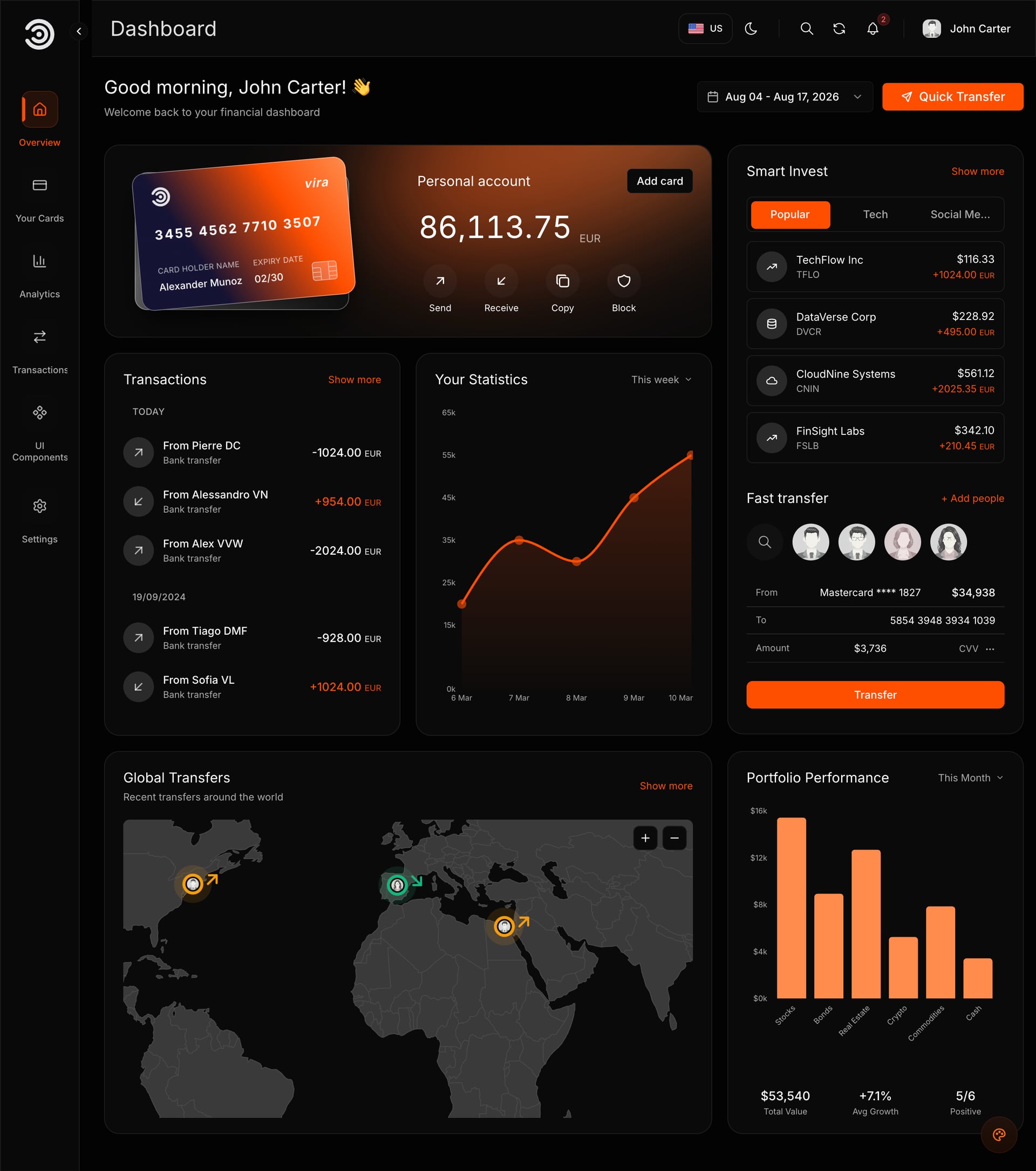
Semantic pairs, tuned for dark
Keep green for gains and red for losses, but tune both for dark surfaces: #22C55E and #EF4444 rather than saturated primaries. Then add a second cue so the pair survives color vision deficiency.
- An arrow or a sign next to every colored number
- Balance cards one surface step above the transaction table
- Sparklines inside cards, full axes only at full width
- A failed payment gets a muted left border, not a filled red row
One accent, swapped in a config file
The accent is a token, not a hundred hard-coded hex values. Switching it recolors the card, the charts, the buttons and the active menu item at once, which is what makes a template usable for a brand that is not yours.
- Charts inherit the accent instead of carrying their own palette
- Neutrals stay fixed, so contrast ratios hold across themes
- Dark and light are two values of the same tokens
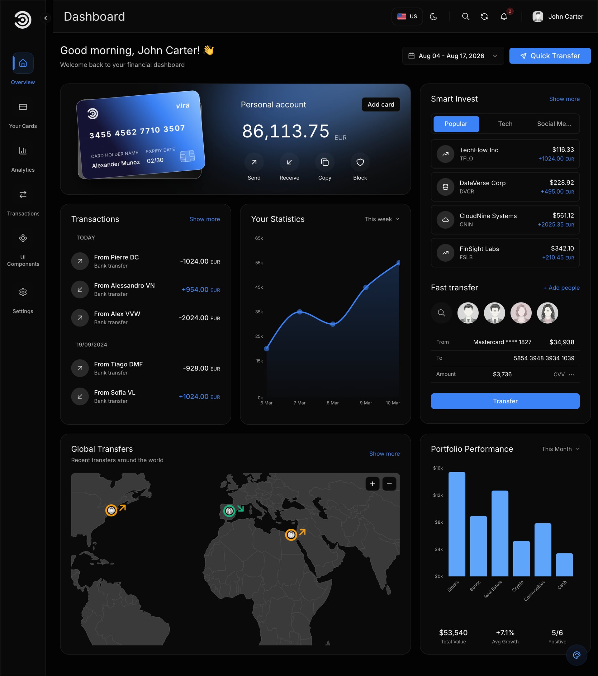
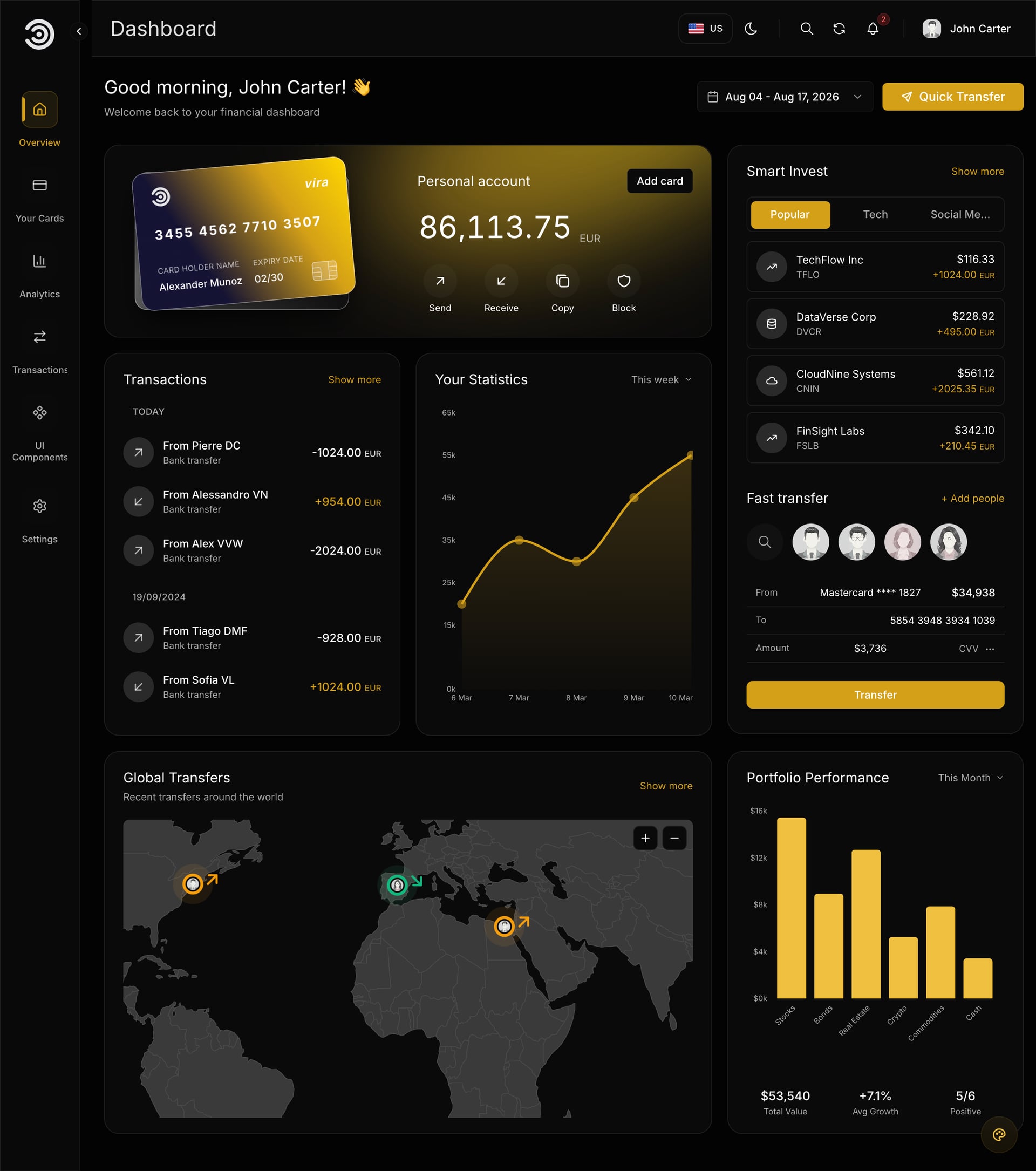
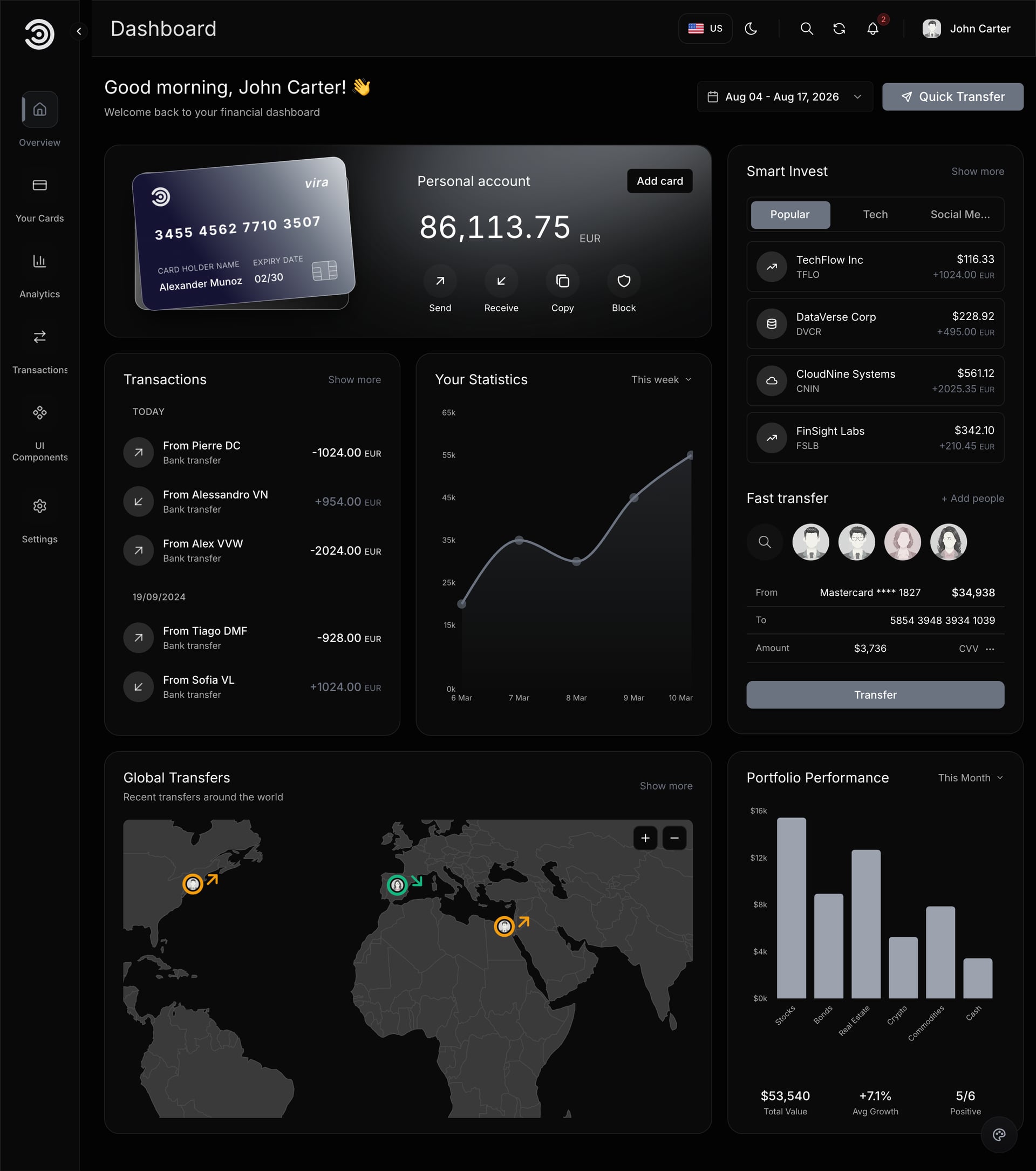
These come from the Next.js financial and banking dashboard template: dark and light themes, account cards, transactions, analytics and authentication on Next.js 16 and Tailwind CSS 4.
SaaS and admin panel designs
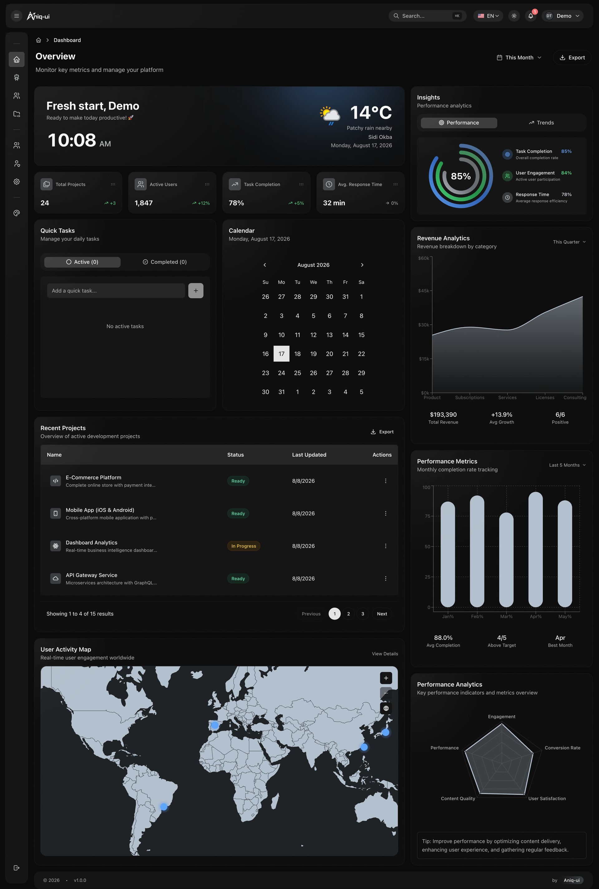
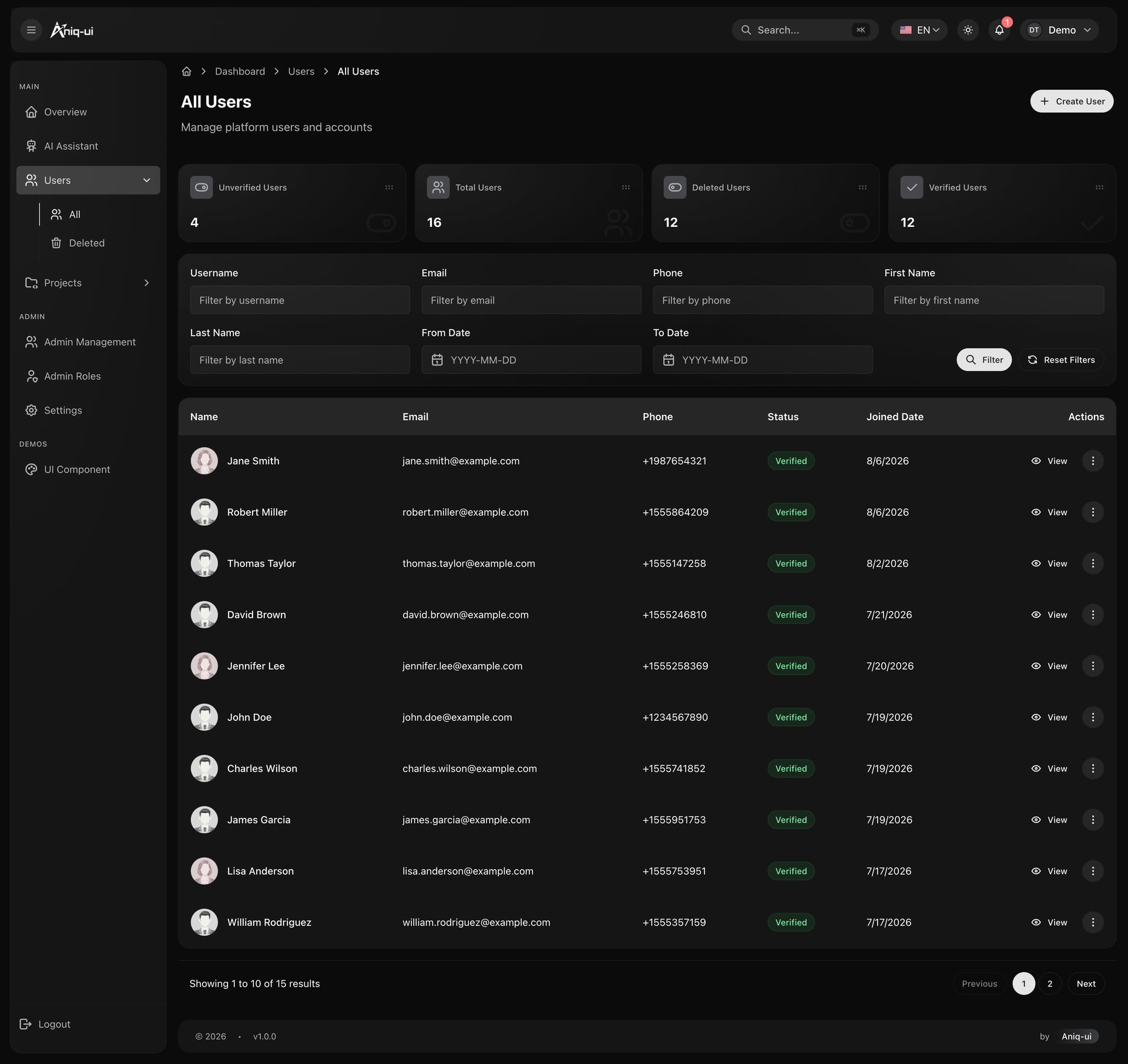
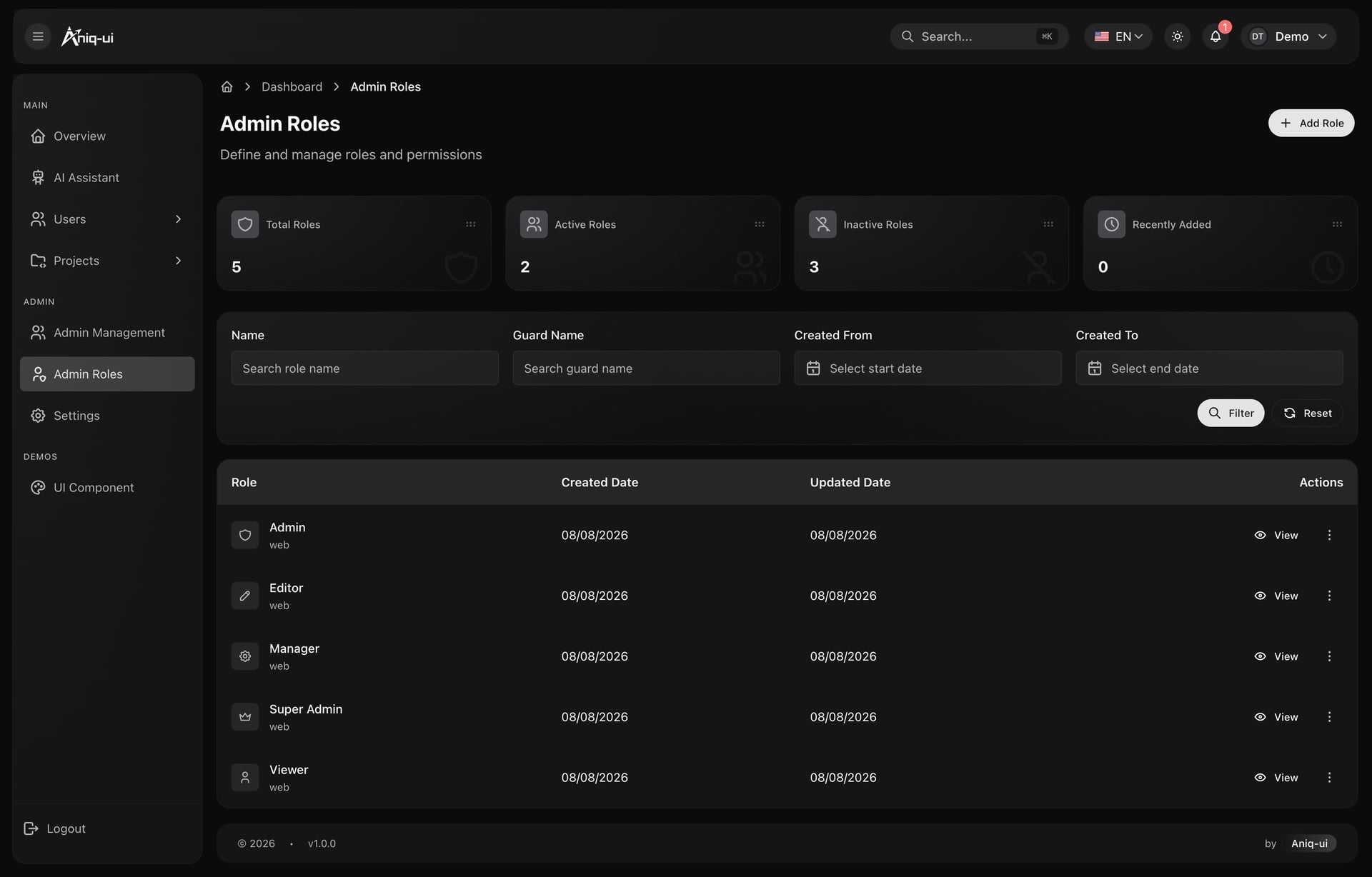
Admin panels live or die by their tables and forms, and dark mode makes both harder than they look.
Tables that stay quiet
Zebra striping doubles the number of surfaces on screen. A one pixel rule at low white opacity separates rows without adding a second background, and inputs recess to the page color inside a raised card so the fillable area reads as a well.
- Row separation by rule, never by stripe
- Skeletons at 8 to 10 percent white, not gray blocks from the light theme
- One series palette shared by every analytics section
- Empty states designed for dark rather than inherited
A component library you can read
The parts a dark dashboard is assembled from deserve their own page: badges, avatars, tables, dialogs, menus, inputs and charts, each with the code beside it. It is also the fastest way to check contrast decisions in one place.
- Every variant on one surface, so tints can be compared
- Code beside each example instead of in a separate doc
- Status colors defined once and reused everywhere
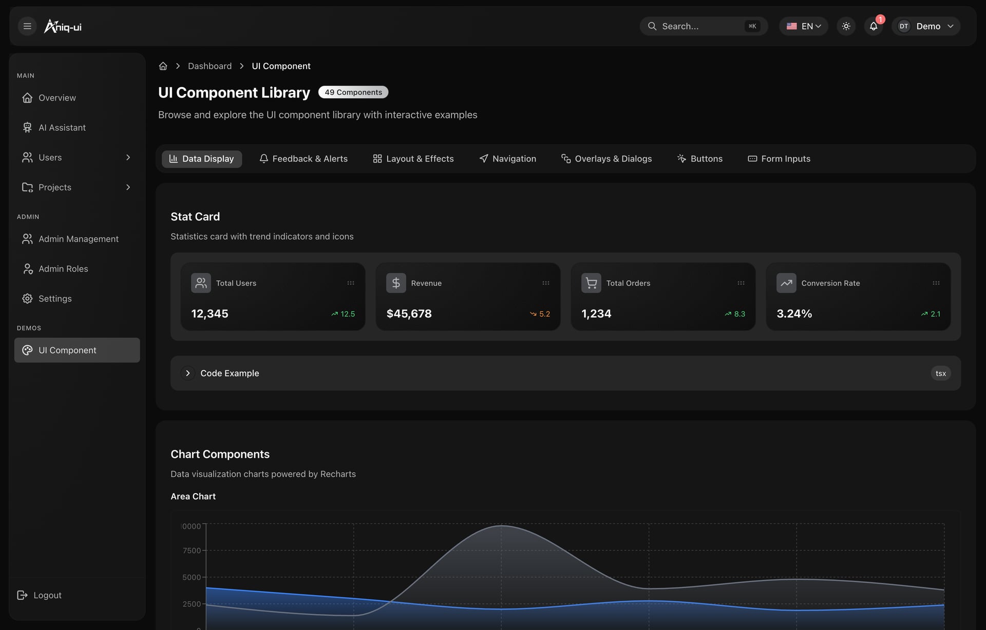
Those screens are from the Next.js dashboard template with an AI assistant, which ships the panel, the assistant and a NestJS backend together.
Trading dashboard designs
Trading is the hardest dark mode case, because everything updates live and the cost of misreading is immediate.
- Candlesticks need the strongest contrast on the page. Up and down candles should hit at least 3:1 against the chart background, and wicks should not drop below 2:1 or they vanish at small sizes.
- One accent for the live price. The current price line and its axis label take the brightest accent in the design; everything else steps back.
- Motion discipline. Value changes flash by tinting the number itself for a few hundred milliseconds. Rows that slide or pulse continuously exhaust the eye within minutes.
- Depth of book as bars, not gradients. Gradients band visibly on dark surfaces; solid low-opacity bars keep the shape legible.
- Numbers that never reflow. Tabular figures and fixed decimal places, so a price ticking from 9.99 to 10.00 does not shift the column.
Fitness and health dashboard designs
Fitness dashboards can afford the most color of any vertical, and this is the one place where a slightly vibrant palette is right.
- Rings and radial progress read better on dark than light, because the unfilled track can sit at a subtle white opacity instead of a gray that fights the page.
- Zone colors step through hue, not lightness. Recovery, cardio and peak have to stay distinguishable in peripheral vision, mid-workout, at arm's length.
- Big numerals, small labels. The metric is the interface: step counts and heart rates in large tabular figures, with quiet uppercase labels beneath.
- Streak calendars need a scale, not a binary. Four or five steps of the same hue read as effort; on or off reads as a checklist.
The same dashboards in light mode
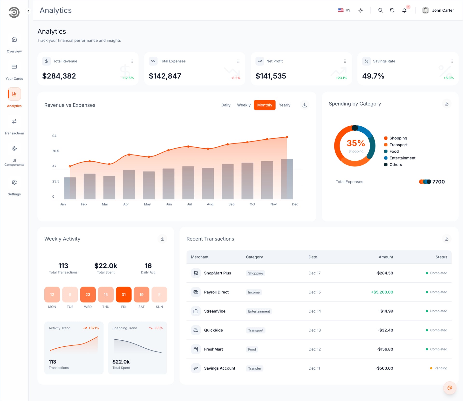
A dark dashboard that cannot become a light one was designed as a picture, not as a system. Both themes here are two values of the same tokens, which is why the screens below are the same components.
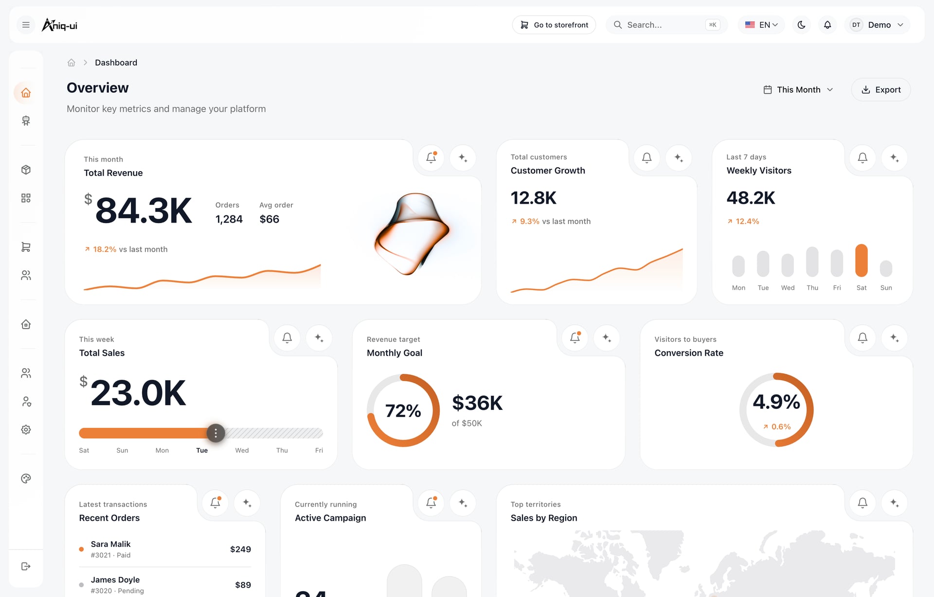
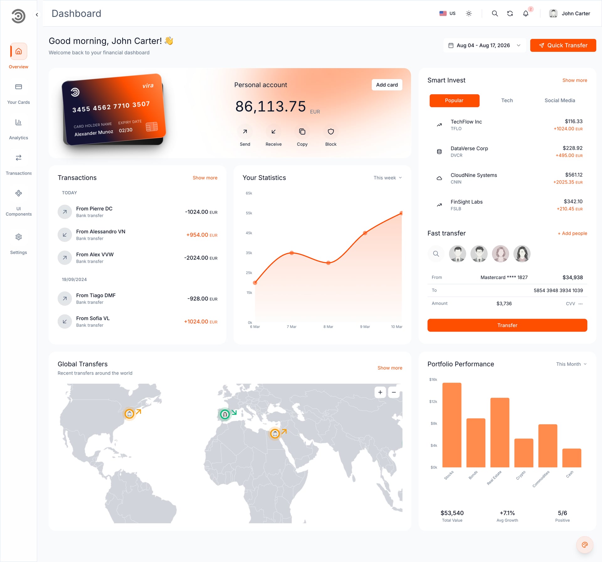
Three things change on the way to light, and only three: surfaces invert their order so cards sit above a tinted page, accents gain saturation to hold up against white, and shadows come back because they are visible again.
A copy-paste dark dashboard palette
Every screen above is a variation on this set. Paste it into your token file and the rest is layout.
| Token | Value | Used for |
|---|---|---|
| background | #0B0E13 | Page |
| surface | #11151C | Cards, nav, chrome |
| surface-hover | #171C24 | Hover and active rows |
| text-primary | #E6E8EB | Headings, values |
| text-secondary | #9AA3AE | Labels, captions |
| positive | #22C55E | Gains, success |
| negative | #EF4444 | Losses, errors |
| accent | #60A5FA | Links, primary series |
Check every text and surface pair against WCAG: 4.5:1 for body text, 3:1 for large text and essential UI. Dark themes fail contrast checks more often than light ones, because low-contrast gray on gray looks stylish right up until someone reads it in daylight.
FAQ
The questions that come up every time a team moves a dashboard to dark.
What background color should a dark mode dashboard use?
Not pure black. A very dark desaturated blue-gray such as #0B0E13 reduces OLED smearing and lets you build an elevation scale with lighter surfaces on top. Reserve pure black for media viewers, not data interfaces.
Where can I find real dark mode dashboard examples rather than mockups?
Every screenshot and clip in this article is a running product you can open: the e-commerce back office, the banking dashboard and the AI admin panel all have live demos linked under their screens, and their source ships as Next.js templates. Mockups hide the parts that break, which is usually the tables, the empty states and the third-party charts.
Are dark dashboards actually better for data-heavy work?
They reduce glare in long sessions and dim environments, and they make colored data more prominent. The tradeoff is that dense body text reads slightly slower on dark, so contrast discipline and generous type sizes matter more than they do in light themes.
Which chart colors work best in dark mode?
Series colors at moderate saturation with at least 3:1 contrast against the card surface, gridlines at 6 to 8 percent white opacity, and one shared palette across the whole product. If a series color needs a legend to be identified, label the line directly instead.
Should dashboards keep red and green in dark mode?
Yes, because users arrive with that mapping already learned, but tune both hues for dark surfaces and never let color be the only cue. Pair every red and green with a sign, an icon or a direction so the design survives color vision deficiency.
Do these templates ship a light mode too?
Yes, and from the same token set rather than a second stylesheet, which is why the light screens above are pixel-identical in layout. Two of them also ship Arabic with full right-to-left layout.
Start from a template that already does this
Every rule in this article is implemented in three products, with the palette above as a config file rather than a redesign.
Each one ships dark and light themes, Tailwind CSS tokens, TypeScript and a live demo, so you can check the contrast decisions in a browser before you buy. The rest of the collection sits in the Next.js dashboard and admin panel templates.
You might also like
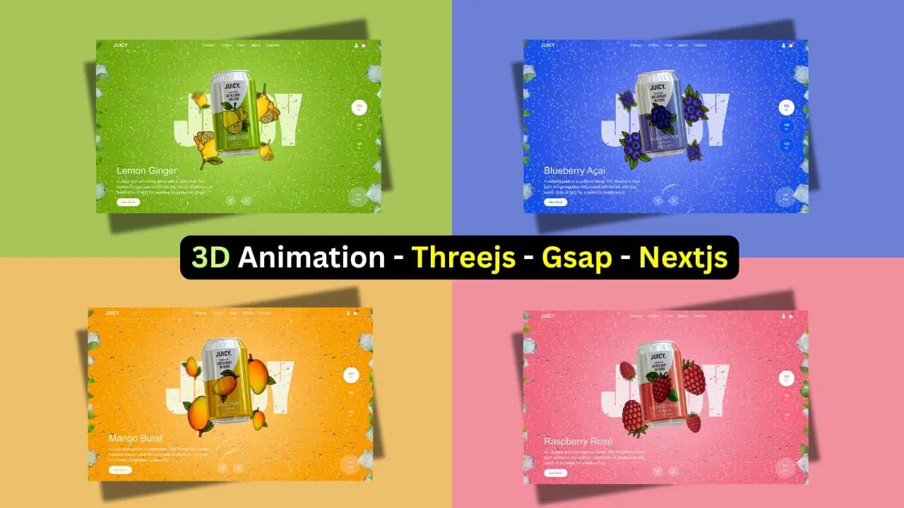
Free 3D Landing Page Template for Juice, Beverage, and Product Marketing Websites (Next.js + Three.js + GSAP)
Download a free 3D animated landing page template, built with Tailwind CSS, Three.js, and Next.js App Router. Perfect for product websites or creative showcases.
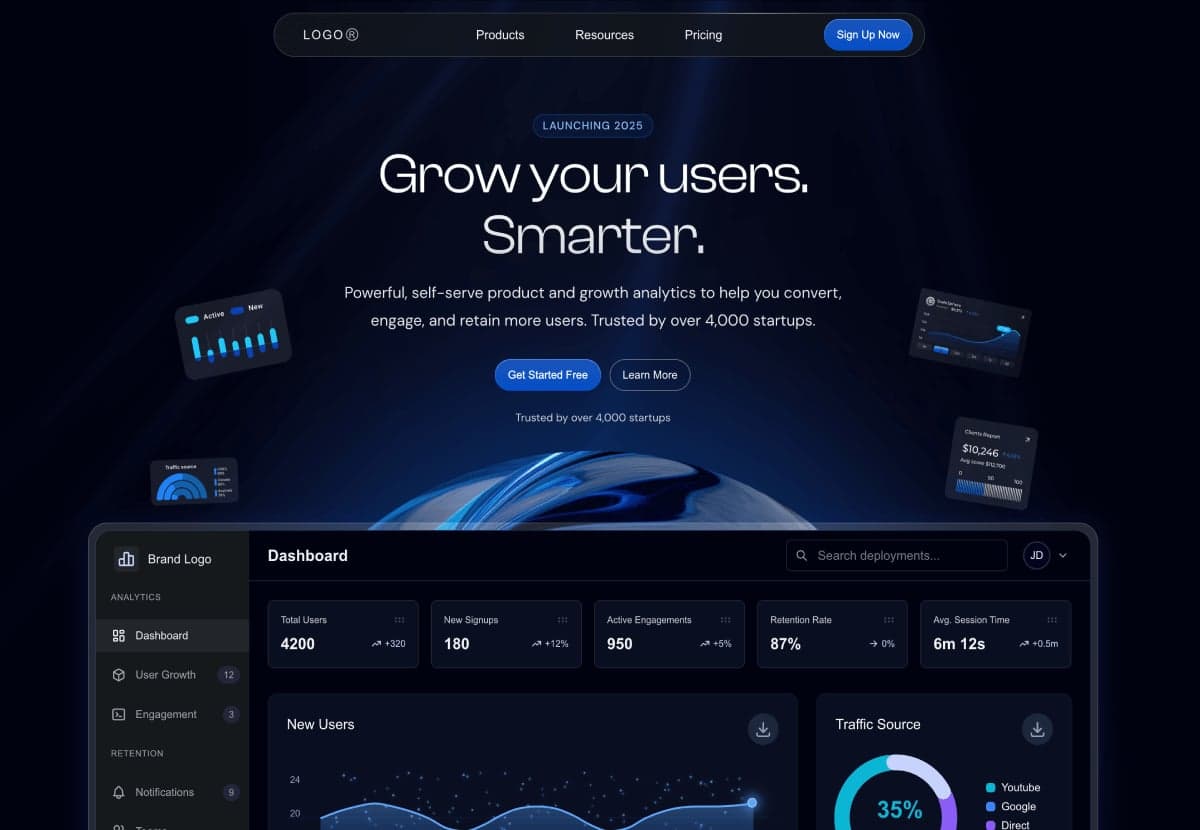
Free Landing Page Templates
Explore three free, production-ready landing page templates, perfect for agencies, corporate sites and SaaS startups. Built with Next.js 15.2.4 and Tailwind CSS for lightning-fast performance and modern design.
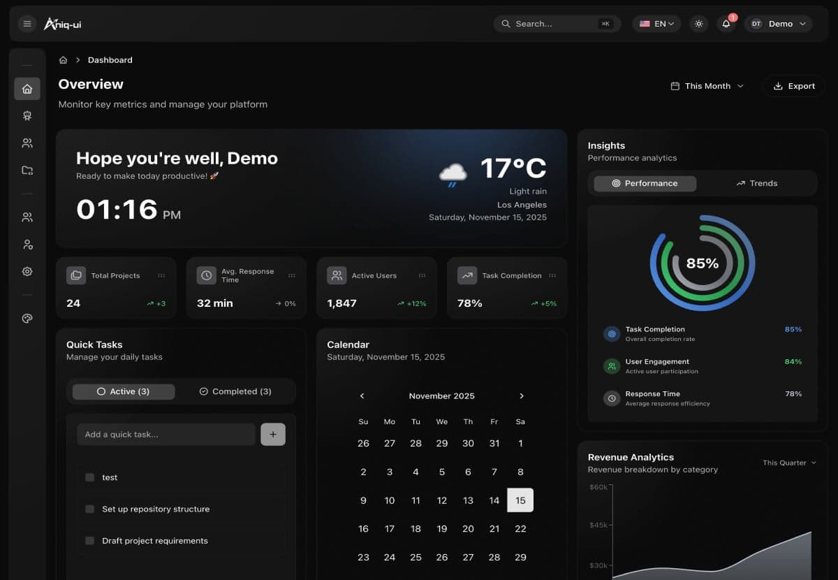
Top 10 Best Next.js Admin Dashboard Templates for 2026
Compare the best free & premium Next.js admin dashboard templates for 2026, built with Next.js 16, React 19, Tailwind CSS, shadcn/ui and TypeScript.
