01 · Layout
Responsive Design
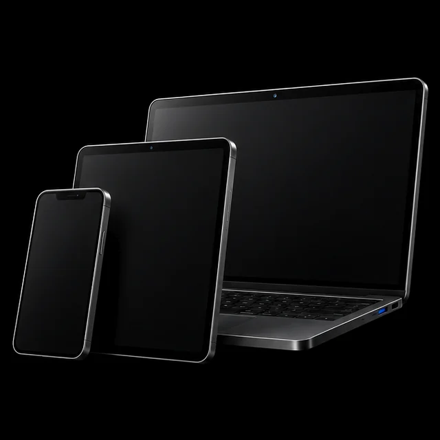
Phone, tablet and desktop layouts from one set of components, with a phone menu and 44px tap targets.
 Learn more: Responsive Design
3D Landing Page Template
Open source, free to use for personal and commercial projects
A lightweight, visually impactful 3D landing page template built with Next.js App Router, Three.js, GSAP and Tailwind CSS.
A lightweight, visually impactful 3D landing page template built with Next.js App Router, Three.js, GSAP and Tailwind CSS.
Open source, free to use for personal and commercial projects
A production‑ready 3D landing page template for Next.js 15 (App Router) that shows you exactly how to embed performant WebGL scenes with Three.js + GSAP.
SEO friendly, responsive, and built with modern tooling (React 19, Tailwind CSS 4, TypeScript). The template focuses on: structured metadata, accessible markup, lazy loading of heavy 3D assets, reduced bundle size, and smooth GPU‑accelerated animations.
What you learn using it:
• How to integrate a Three.js canvas inside a React / Next.js layout.
• How to trigger GSAP timelines based on scroll & viewport.
• How to lazy load and optimize GLTF / 3D assets.
• How to create a dynamic, immersive product hero section.
• How to balance visual fidelity with Core Web Vitals.
Perfect if you want a head start building a 3D product showcase, beverage or packaging presentation, premium marketing hero, or an educational playground to practice real‑world 3D UI techniques in Next.js.
Next.js 15.2.4
React 19
Tailwind CSS 4
Yes
Mobile, Tablet, Desktop
Life time Included
Pro Tip: All templates include comprehensive documentation to get you started quickly.
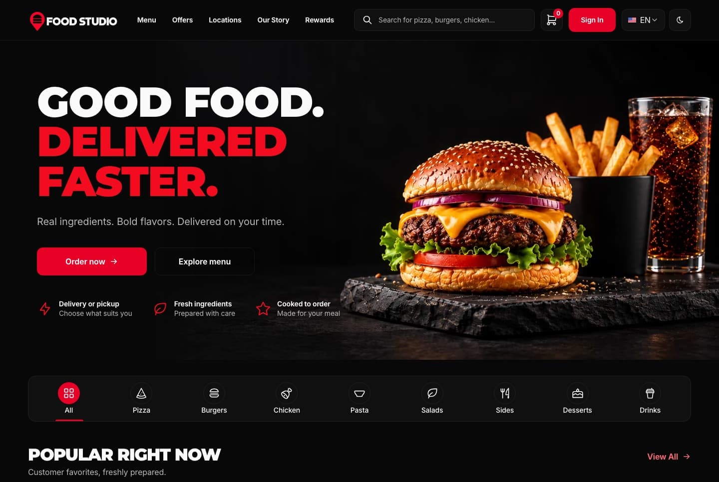
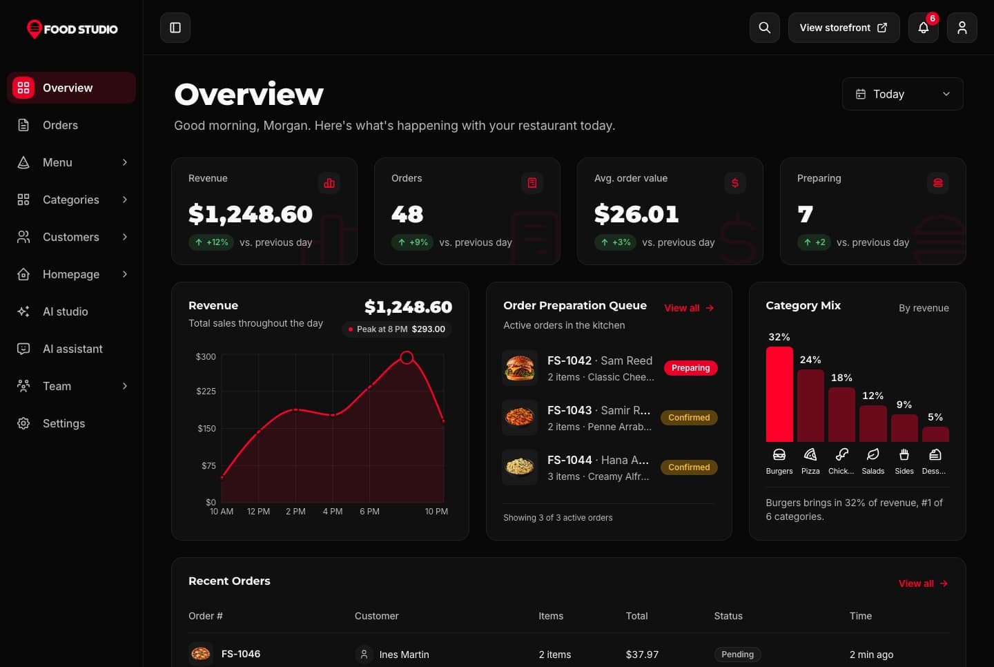
Food Studio is a full-stack Next.js restaurant template: an ordering website with menu, combos, cart, checkout and order tracking, a staff dashboard for orders, the menu and the kitchens, a NestJS API, AI tools for dish photos, and English and Arabic with RTL.
A Next.js 16 restaurant ordering website with a menu, combo meals, a meal builder, cart, checkout, order tracking and customer accounts, in English and Arabic.
A Next.js 16 restaurant admin dashboard for running orders, the menu, categories, customers, kitchens and the team, with an AI studio for dish photos, in English and Arabic.
Be the first to know when a new template is released.
Every premium template is responsive, accessible, fast and typed from the first commit, so your launch starts from production-ready code.
01 · Layout
Phone, tablet and desktop layouts from one set of components, with a phone menu and 44px tap targets.
Learn more: Responsive Design02 · Inclusive
Semantic HTML, labelled controls, a visible keyboard focus ring and reduced motion support.
 Learn more: Accessibility
03 · Speed
Optimized images and fonts, cached data and metadata on every route.
 Learn more: High Performance
04 · Types
Strict TypeScript across every app, with typed props, API responses and data models.
 Learn more: TypeScript Support

Join thousands of developers worldwide who trust Aniq-UI for their projects. Our templates are being used across the globe to create stunning web experiences.
We use cookies to enhance your browsing experience, analyze site traffic, and personalize content. By clicking "Accept All", you consent to our use of cookies for analytics and personalized advertising.