Meilleurs designs de dashboards en mode sombre 2026 : 22 captures réelles
22 captures réelles de dashboards en mode sombre et des clips en direct : admin e-commerce, fintech et SaaS, en sombre et clair, avec l'échelle de surfaces, le contraste et la palette.

Vingt-deux écrans de dashboards réels et quatre clips en direct, capturés sur des produits qui tournent et non sur des maquettes, avec l'échelle de surfaces, les ratios de contraste et la palette de graphiques détaillés plus bas.
Le mode sombre a cessé d'être une simple préférence il y a longtemps. Pour les dashboards, c'est devenu le réglage par défaut : les analystes les gardent ouverts des heures, les traders les surveillent la nuit, et les écrans OLED ont rendu les surfaces profondes naturelles plutôt que ternes. Mais la plupart des dashboards sombres restent des dashboards clairs aux couleurs inversées, et c'est exactement ce qui les rend difficiles à lire.
Ce guide est à la fois une galerie et une spécification. Chaque section montre des écrans réels d'un secteur, puis nomme les décisions derrière eux, avec des valeurs concrètes à coller dans un fichier de configuration.
Ce qui sépare un vrai dashboard sombre d'un thème clair inversé
Inverser un thème clair produit du texte blanc pur sur des cartes noires pures, des accents éblouissants et des lignes de grille invisibles. Un dashboard sombre vraiment conçu repose sur cinq décisions.
- Une échelle de surfaces, pas un seul noir. Un fond de page presque noir comme
#0B0E13, des cartes montées à#11151C, des états survolés à#171C24. En thème sombre, l'élévation se communique par des surfaces plus claires, pas par des ombres, qui disparaissent de toute façon sur fond sombre. - Un blanc cassé pour le texte. Le
#FFFFFFpur sur presque noir crée des halos sur les dalles OLED. Quelque chose comme#E6E8EBpour le texte principal et#9AA3AEpour le secondaire garde les longues sessions confortables tout en restant au-dessus du ratio WCAG de 4.5:1 pour le corps de texte. - Des accents désaturés. Les couleurs de marque et d'état réglées pour des fonds blancs brillent trop sur du sombre. Baisser légèrement la saturation et monter la luminosité garde la teinte reconnaissable sans effet néon.
- Un contraste propre aux graphiques. Grilles en faible opacité (blanc à 6 ou 8 pour cent), couleurs de séries à au moins 3:1 contre la carte, et infobulles sur la surface élevée pour se lire au-dessus du graphique.
- Des chiffres tabulaires. Toute colonne d'argent ou de métriques a besoin de chiffres tabulaires alignés pour que les comparaisons se lisent verticalement. Les interfaces sombres pardonnent moins le désalignement, car il y a moins de structure visuelle autour des nombres.
Designs de dashboards d'administration e-commerce
Les dashboards de boutique mêlent argent, stock et images, ce qui en fait un hybride des règles fintech et SaaS, et le plus difficile des trois à garder calme.
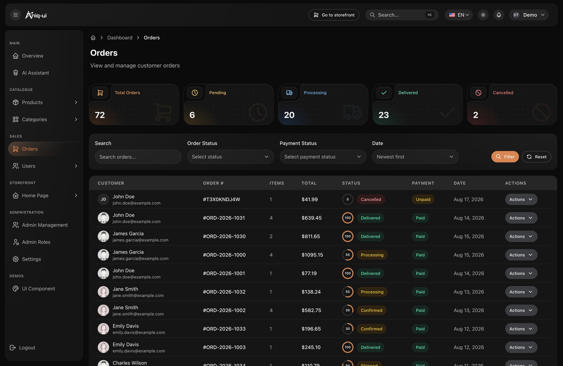
Commandes : l'état en puces teintées
Deux faits indépendants reçoivent deux puces, donc personne n'a à deviner si l'argent est arrivé. Les tuiles de statistiques se posent au-dessus du tableau, ce qui rend la forme de la journée lisible avant de parcourir la moindre ligne.
- L'état de commande et l'état de paiement ne partagent jamais une étiquette
- Un anneau de progression sur chaque ligne plutôt qu'une colonne de pourcentage
- Filtres en creux au fond de page, tableau surelevé, pour que l'œil se pose sur les données
- Un seul vocabulaire de puces, réutilisé sur la page de suivi du client
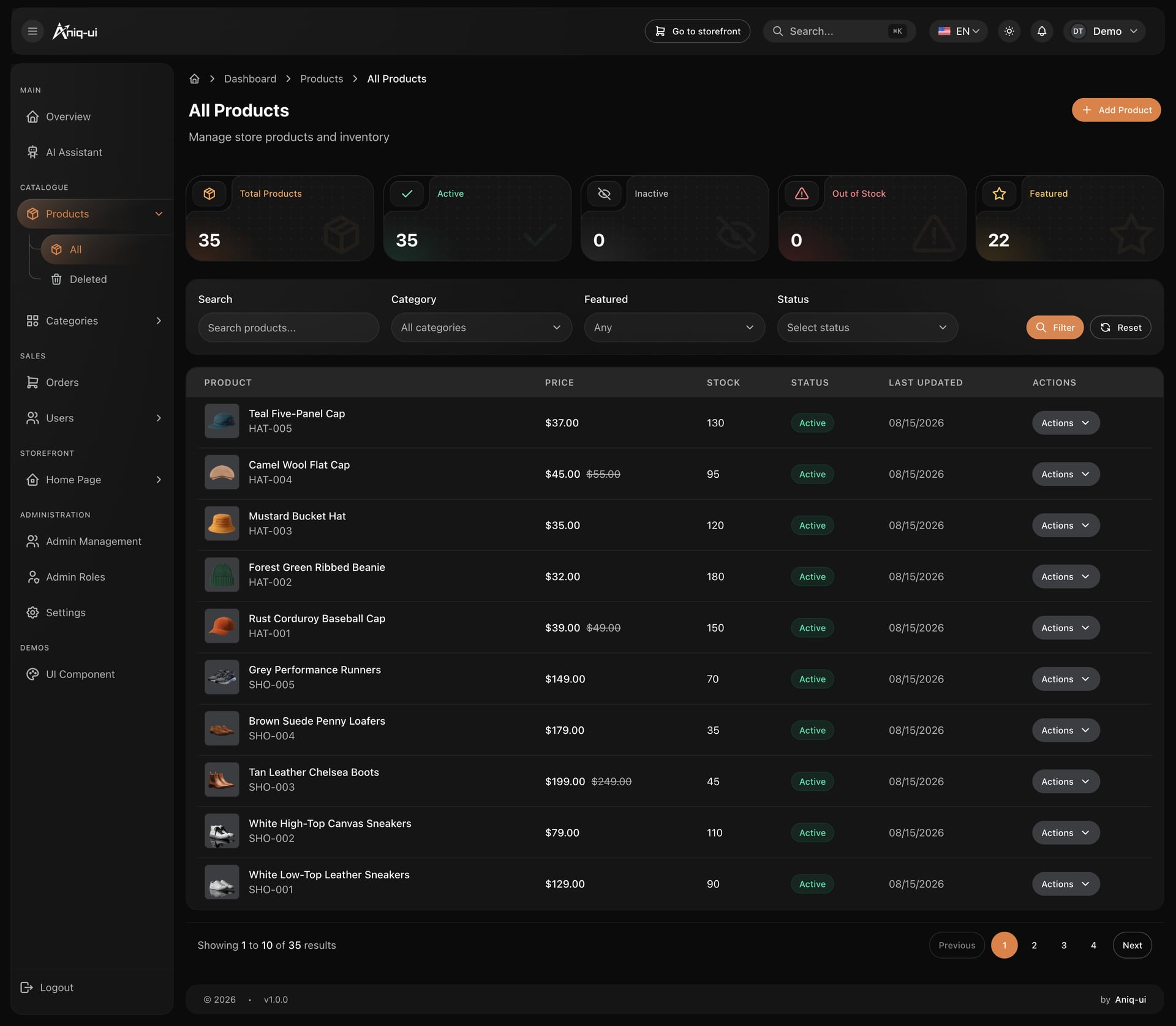
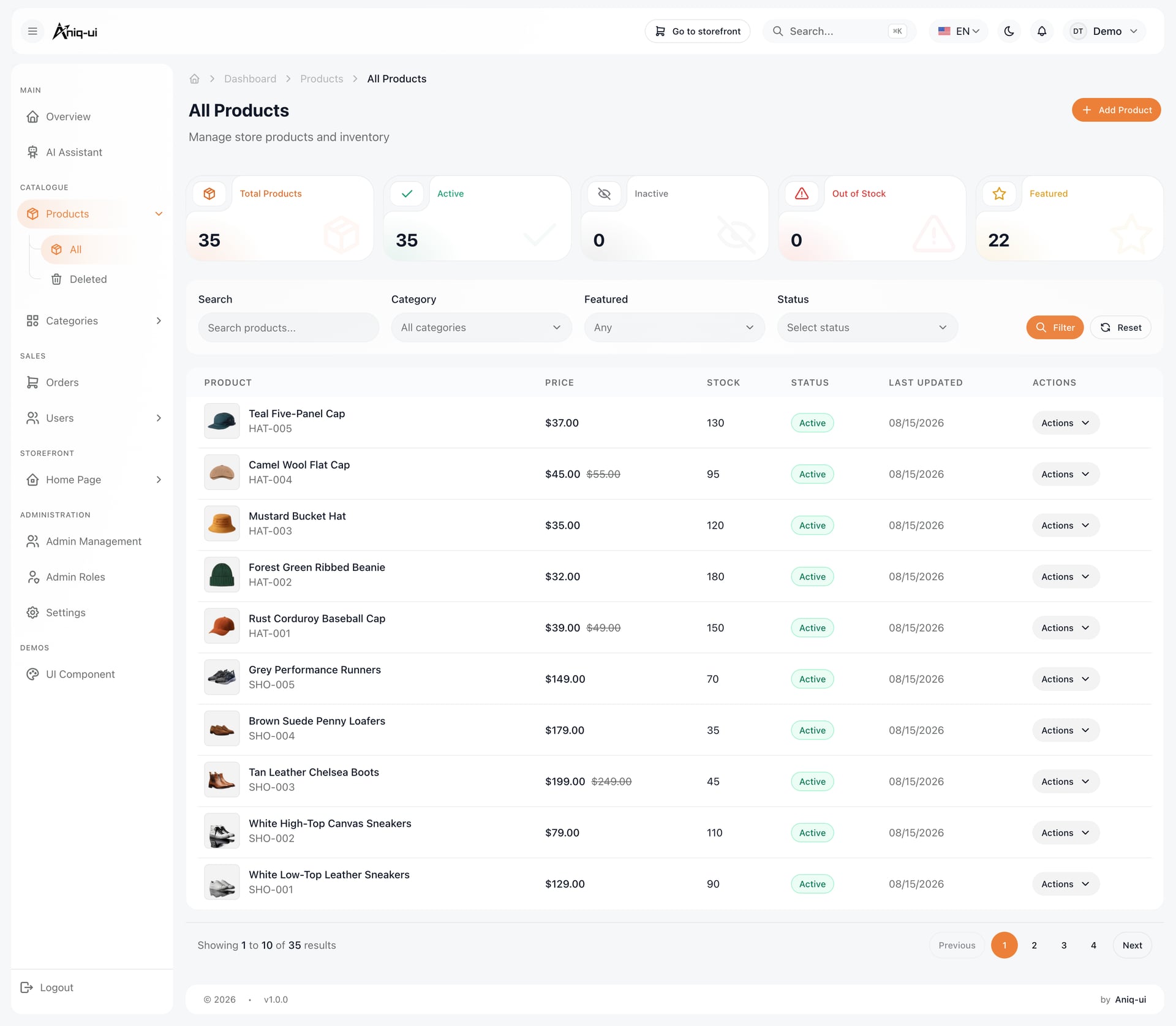
Les vignettes produit sont là où les dashboards de boutique sombres échouent. Les photos arrivent sur tous les fonds imaginables, donc chaque vignette a besoin d'un remplissage de tuile fixe et d'un ratio fixe. Sans cela, une photo sur fond blanc perce un trou dans le tableau et la grille de lignes cesse de se lire comme une grille.
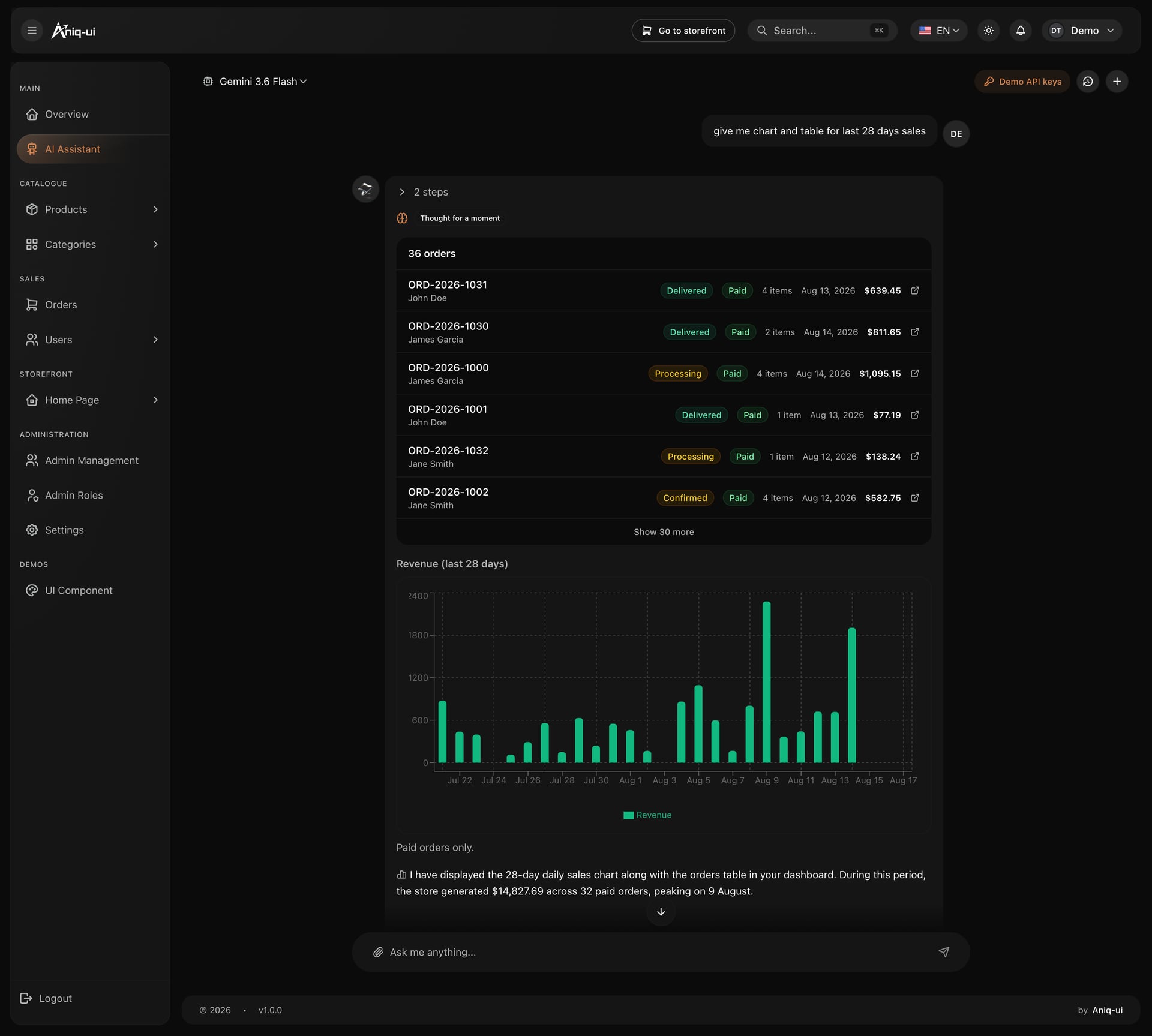
Un assistant qui répond avec les chiffres de la boutique
Les graphiques générés dans la conversation suivent la même palette que le reste du produit, donc une réponse ressemble à une partie du dashboard et non à une capture collée dans un chat.
- Tableau de commandes en direct et graphique de revenus quotidien dans une seule réponse
- Couleur de série à saturation modérée, grilles à 6 pour cent de blanc
- Le total écrit sous le graphique, pour le lecteur qui ne veut pas compter les barres
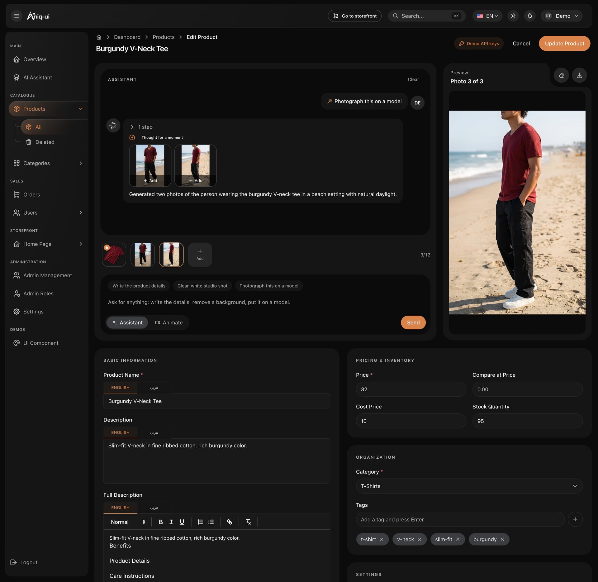
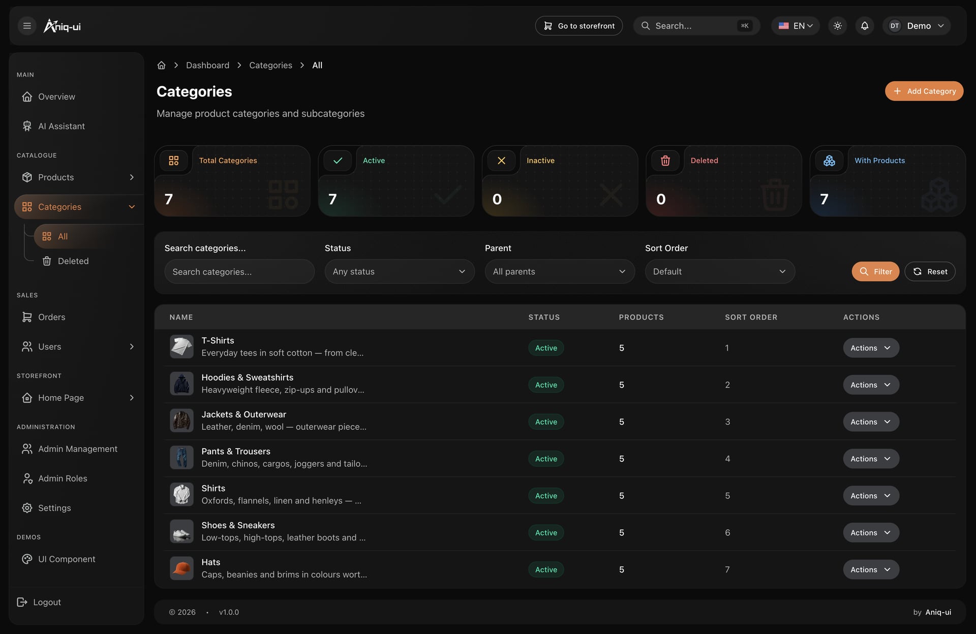
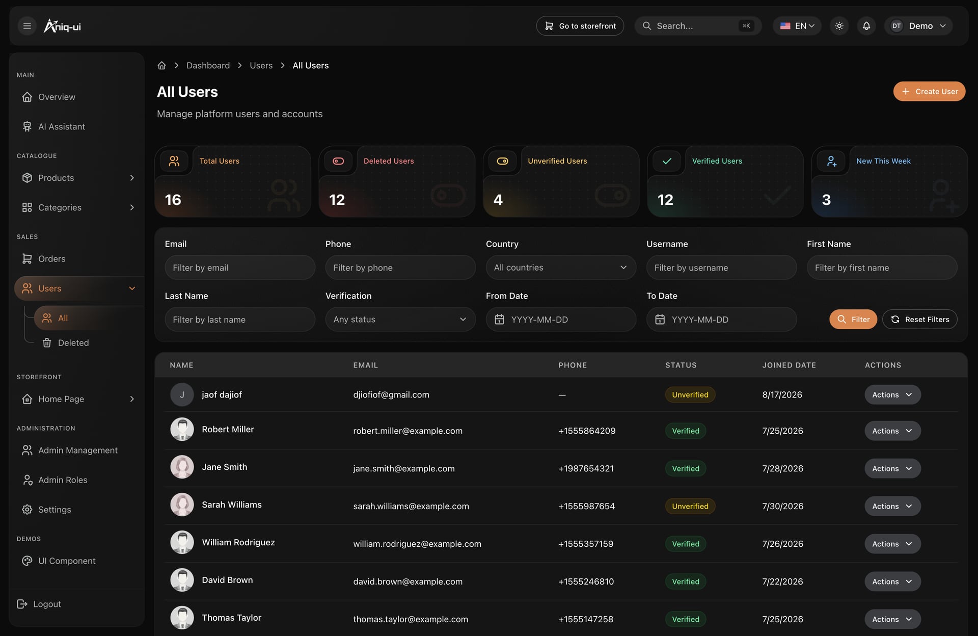
Tous ces écrans viennent du template e-commerce Next.js avec dashboard admin, qui associe cette arrière-boutique à la boutique qu'elle pilote, en anglais et en arabe avec RTL complet.
Designs de dashboards fintech et bancaires
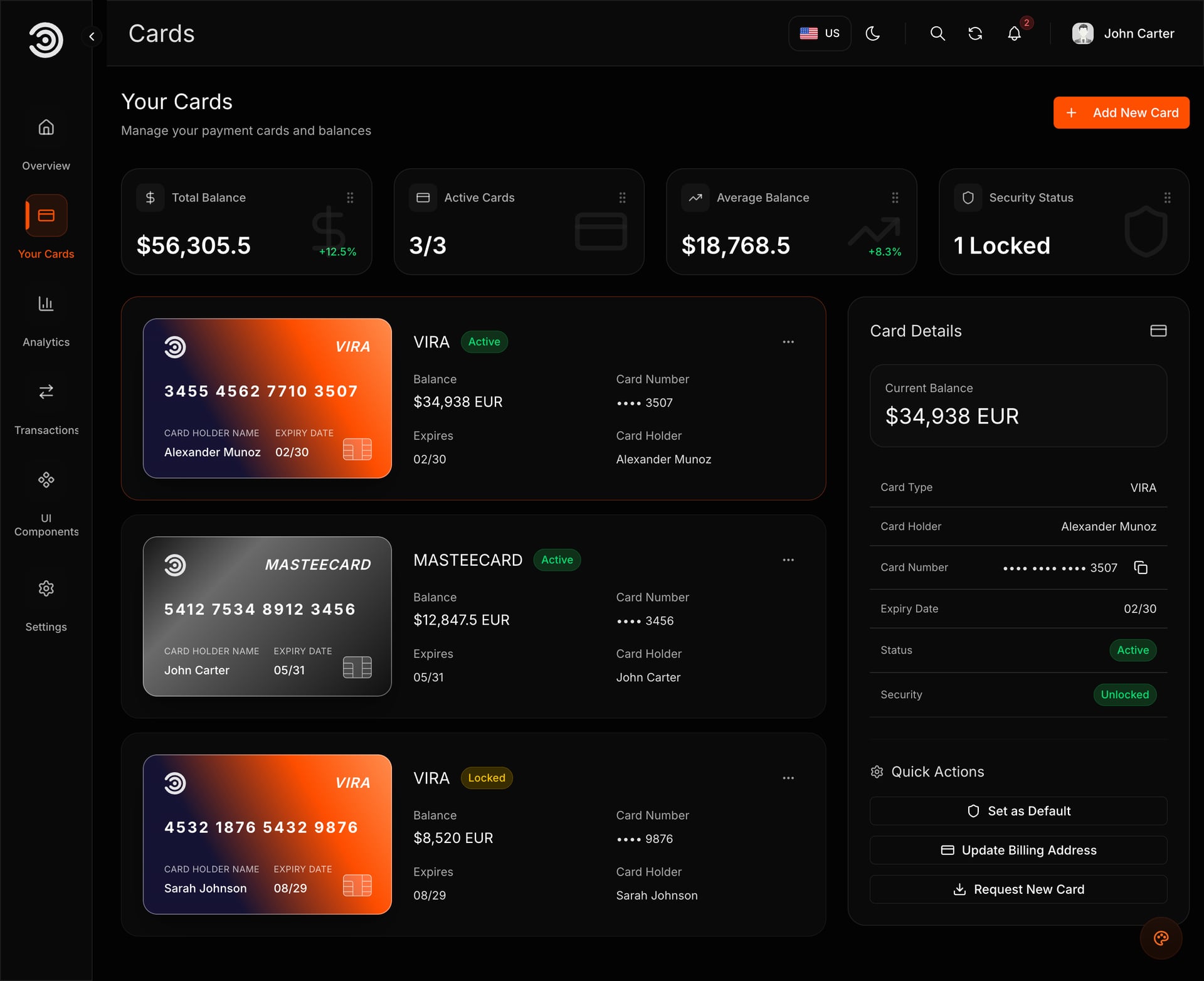
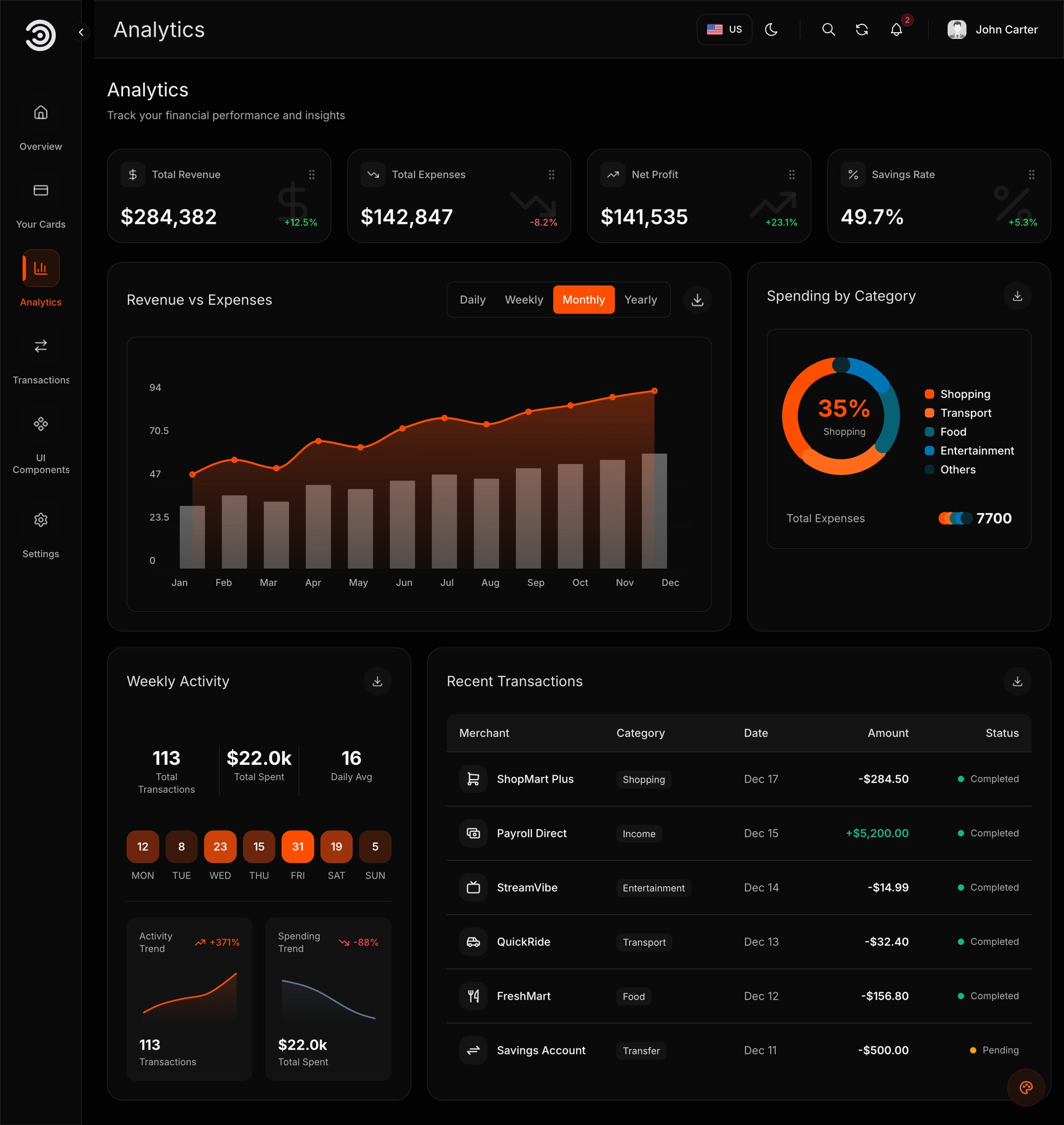
Les dashboards financiers portent les exigences les plus strictes : tableaux denses, sémantique de profits et pertes, et un public qui les lit toute la journée.
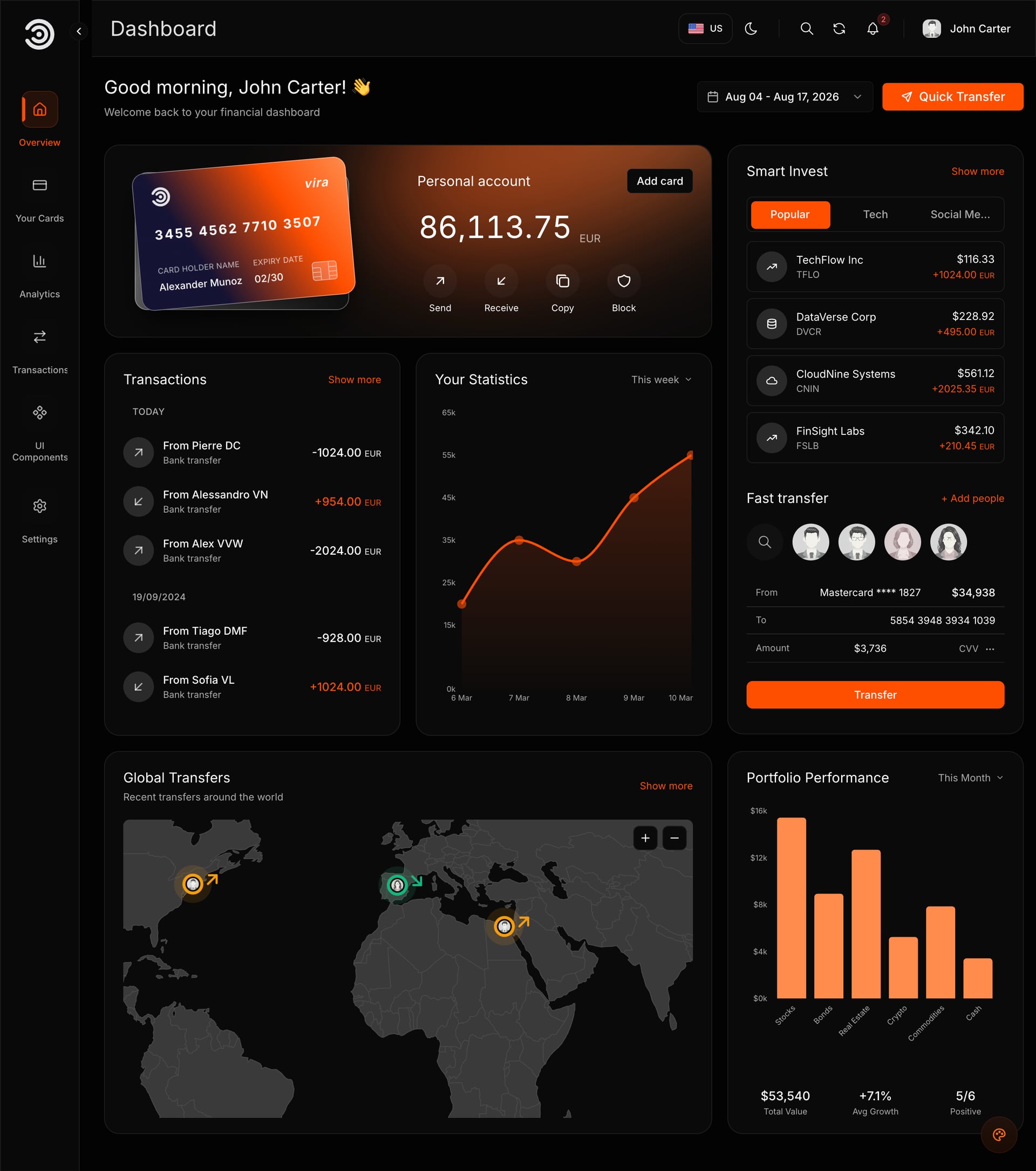
Des paires sémantiques réglées pour le sombre
Gardez le vert pour les gains et le rouge pour les pertes, mais réglez les deux pour des surfaces sombres : #22C55E et #EF4444 plutôt que des primaires saturées. Puis ajoutez un second indice pour que la paire survive aux déficiences de vision des couleurs.
- Une flèche ou un signe à côté de chaque nombre coloré
- Cartes de solde un cran de surface au-dessus du tableau
- Sparklines dans les cartes, axes complets seulement en pleine largeur
- Un paiement échoué reçoit une bordure latérale assourdie, pas une ligne rouge pleine
Un accent, changé dans un fichier de configuration
L'accent est un token, pas cent valeurs hexadécimales écrites à la main. Le changer recolore la carte, les graphiques, les boutons et l'élément actif du menu d'un coup, et c'est ce qui rend un template utilisable pour une marque qui n'est pas la vôtre.
- Les graphiques héritent de l'accent au lieu de porter leur propre palette
- Les neutres restent fixes, donc les ratios de contraste tiennent
- Sombre et clair sont deux valeurs des mêmes tokens
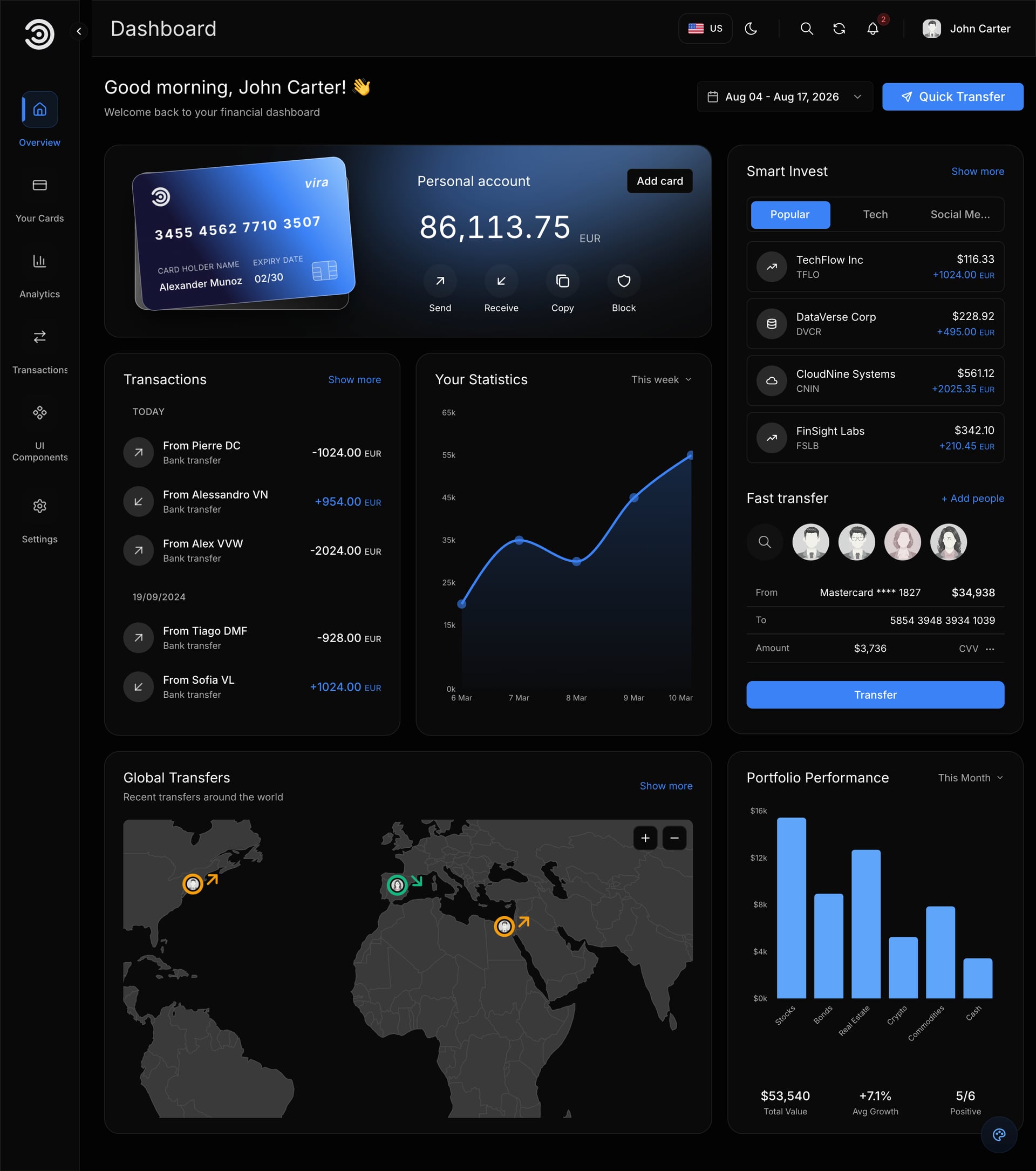
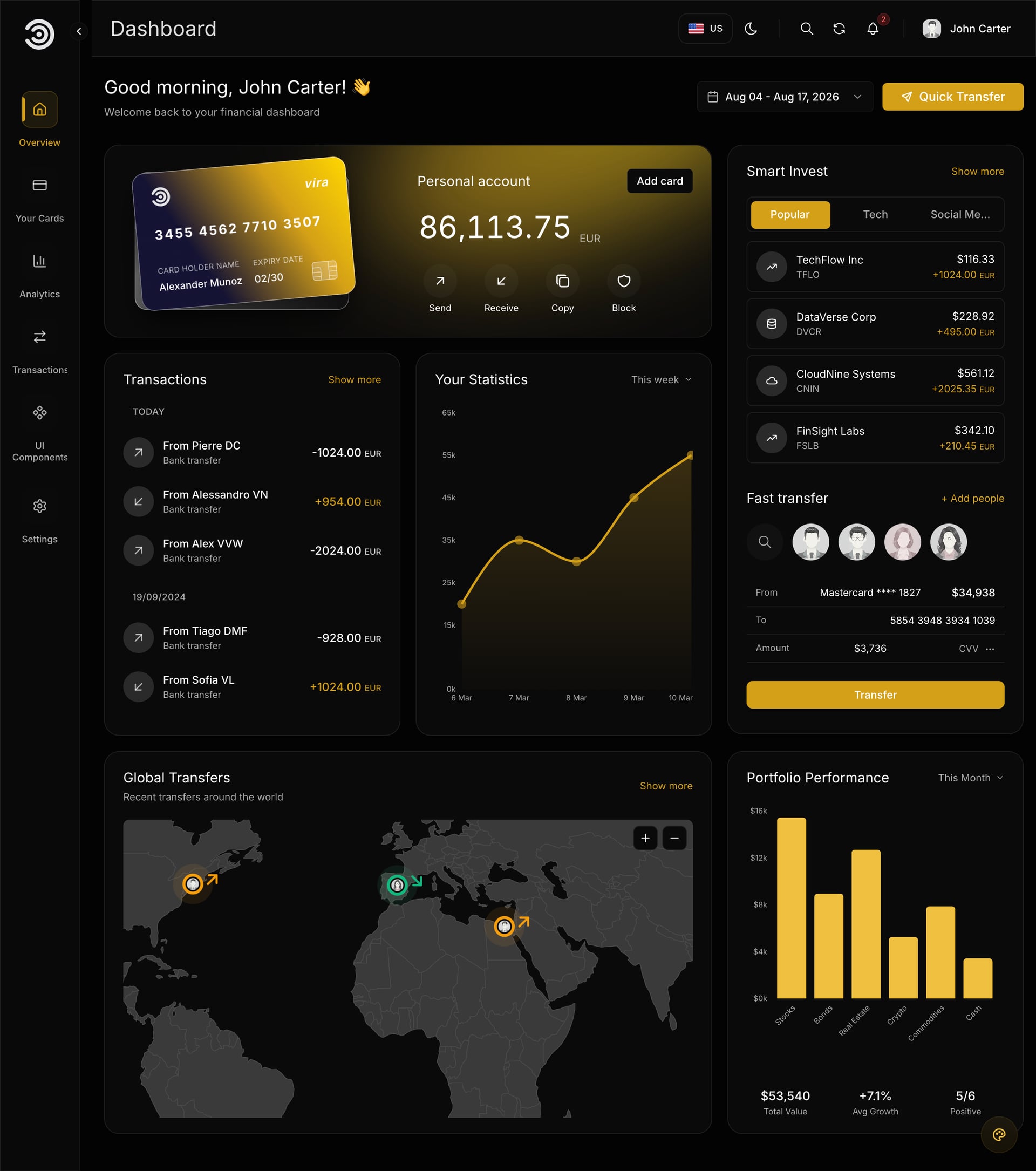
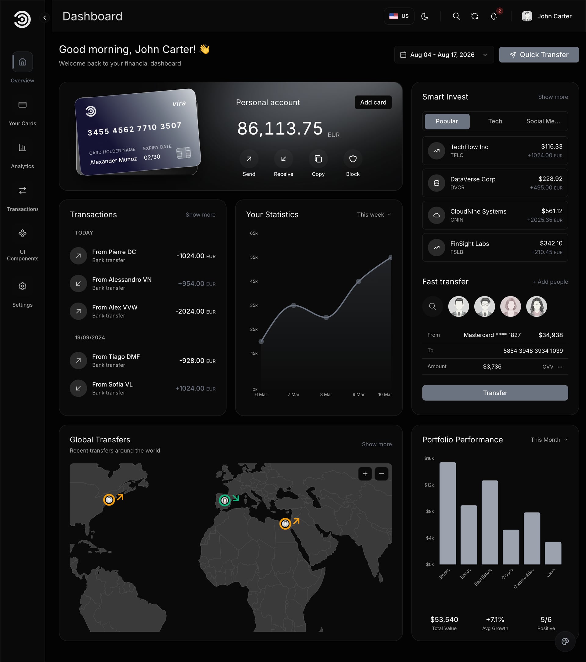
Ceux-là viennent du template de dashboard financier et bancaire Next.js : thèmes sombre et clair, cartes de comptes, transactions, analytique et authentification sur Next.js 16 et Tailwind CSS 4.
Designs de dashboards SaaS et de panneaux d'administration
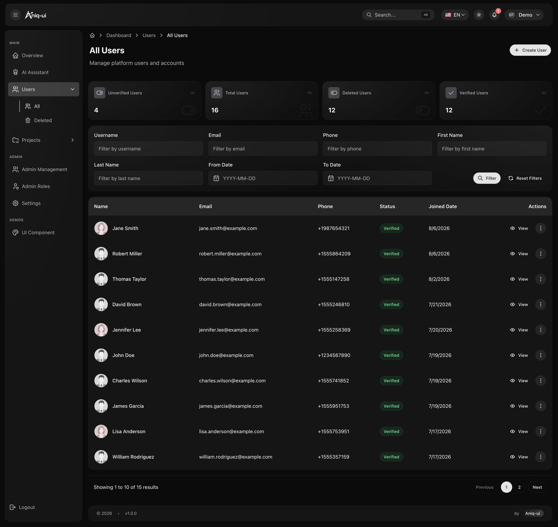
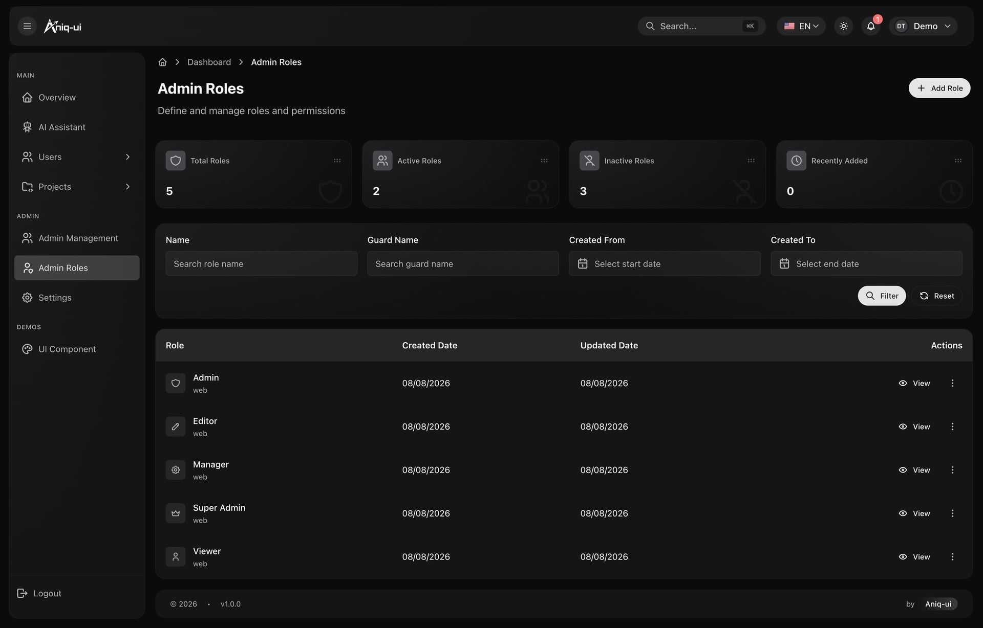
Les panneaux d'administration vivent ou meurent par leurs tableaux et leurs formulaires, et le mode sombre rend les deux plus difficiles qu'il n'y paraît.
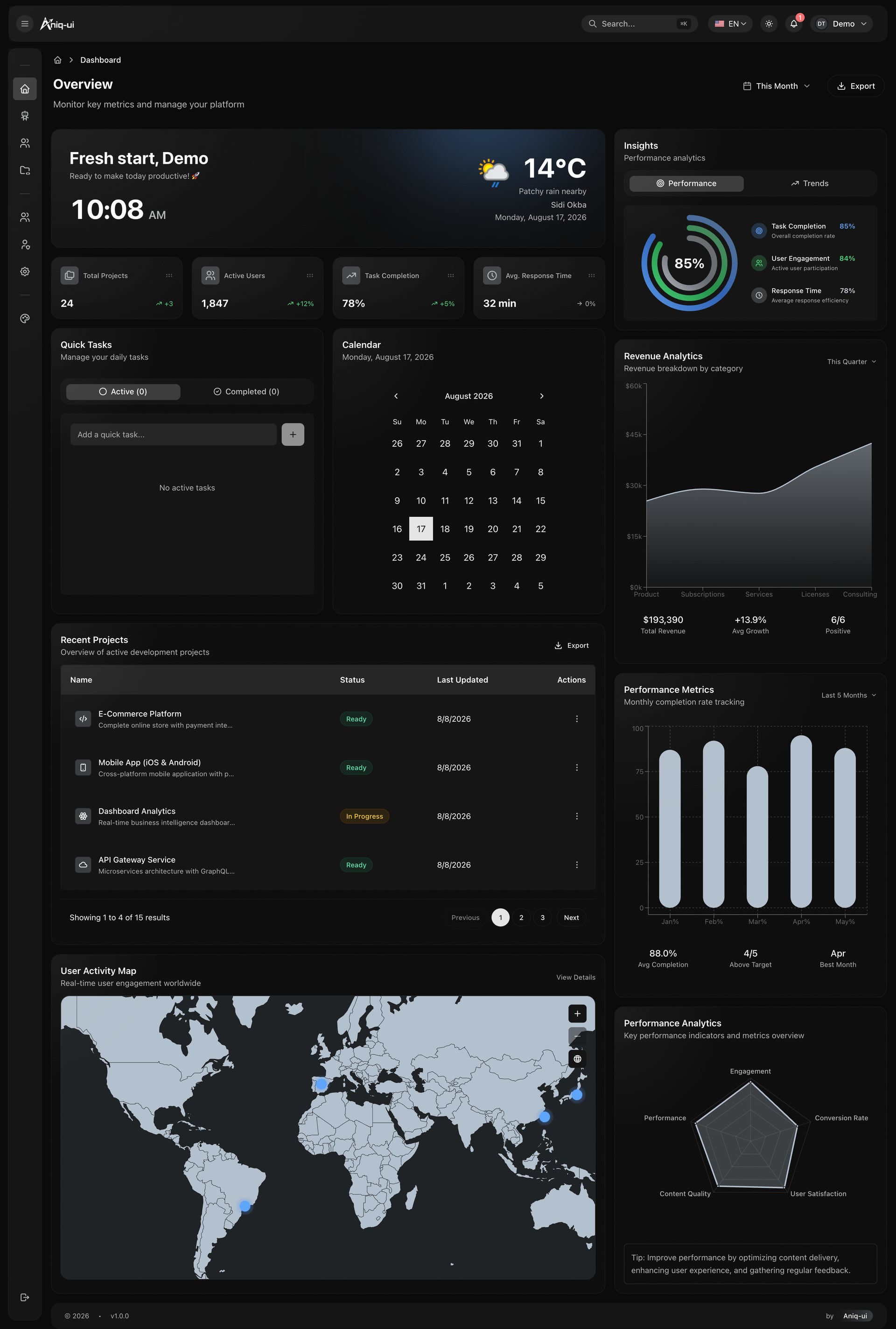
Des tableaux qui restent calmes
Le zébrage double le nombre de surfaces à l'écran. Un filet d'un pixel en faible opacité blanche sépare les lignes sans ajouter un second fond, et les champs descendent à la couleur de page dans une carte surelevée pour que la zone à remplir se lise comme un creux.
- Séparation des lignes par filet, jamais par zébrage
- Squelettes à 8 ou 10 pour cent de blanc, pas des blocs gris du thème clair
- Une seule palette de séries partagée par toutes les analytiques
- États vides conçus pour le sombre et non hérités
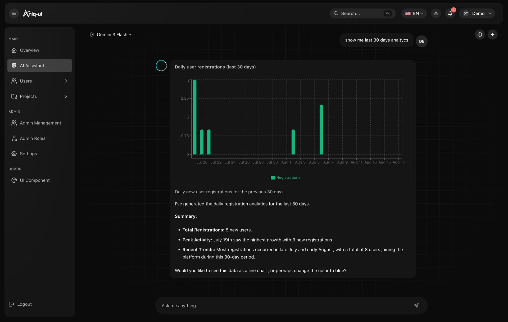
Une bibliothèque de composants lisible
Les pièces avec lesquelles un dashboard sombre est assemblé méritent leur propre page : badges, avatars, tableaux, dialogues, menus, champs et graphiques, chacun avec son code à côté. C'est aussi le moyen le plus rapide de vérifier les décisions de contraste au même endroit.
- Toutes les variantes sur une même surface, pour comparer les teintes
- Le code à côté de chaque exemple plutôt que dans un document séparé
- Des couleurs de statut définies une fois et réutilisées partout
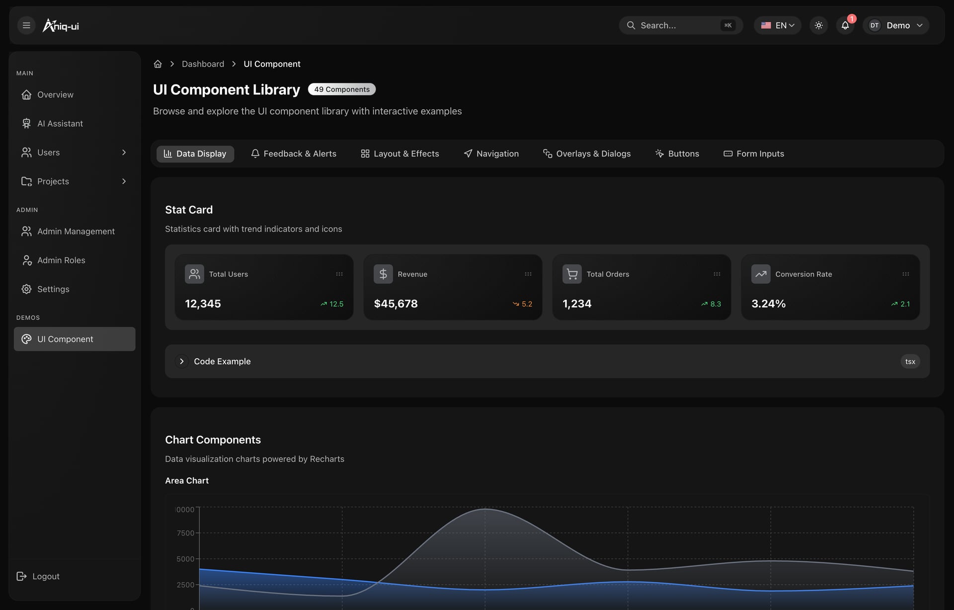
Ces écrans viennent du template de dashboard Next.js avec assistant IA, qui livre le panneau, l'assistant et un backend NestJS ensemble.
Designs de dashboards de trading
Le trading est le cas sombre le plus difficile, parce que tout se met à jour en direct et qu'une mauvaise lecture coûte immédiatement.
- Les chandeliers demandent le plus fort contraste de la page. Les couleurs haussière et baissière doivent atteindre au moins 3:1 contre le fond du graphique, et les mèches ne doivent pas descendre sous 2:1 sous peine de disparaître.
- Un seul accent pour le prix en direct. La ligne de prix courant et son étiquette d'axe reçoivent l'accent le plus lumineux ; tout le reste recule.
- De la discipline dans le mouvement. Les changements de valeur teintent le chiffre lui-même quelques centaines de millisecondes. Des lignes qui glissent ou pulsent en continu épuisent l'œil en quelques minutes.
- La profondeur de marché en barres, pas en dégradés. Les dégradés créent des bandes visibles sur le sombre ; des barres pleines en faible opacité gardent la forme lisible.
- Des nombres qui ne bougent jamais. Chiffres tabulaires et décimales fixes, pour qu'un prix passant de 9.99 à 10.00 ne décale pas la colonne.
Designs de dashboards fitness et santé
Le fitness peut se permettre plus de couleur que tout autre secteur, et c'est le seul endroit où une palette un peu vive est juste.
- Les anneaux et la progression radiale se lisent mieux sur sombre que sur clair, parce que la piste non remplie peut rester à une faible opacité blanche au lieu d'un gris qui lutte avec la page.
- Les couleurs de zones progressent en teinte, pas en luminosité. Récupération, cardio et pic doivent rester distinctes en vision périphérique, en pleine séance, à bout de bras.
- Grands chiffres, petites étiquettes. La métrique est l'interface : pas et fréquence cardiaque en grands chiffres tabulaires, avec des libellés discrets en dessous.
- Les calendriers de séries ont besoin d'une échelle, pas d'un binaire. Quatre ou cinq paliers de la même teinte se lisent comme un effort ; allumé ou éteint se lit comme une liste de tâches.
Les mêmes dashboards en mode clair
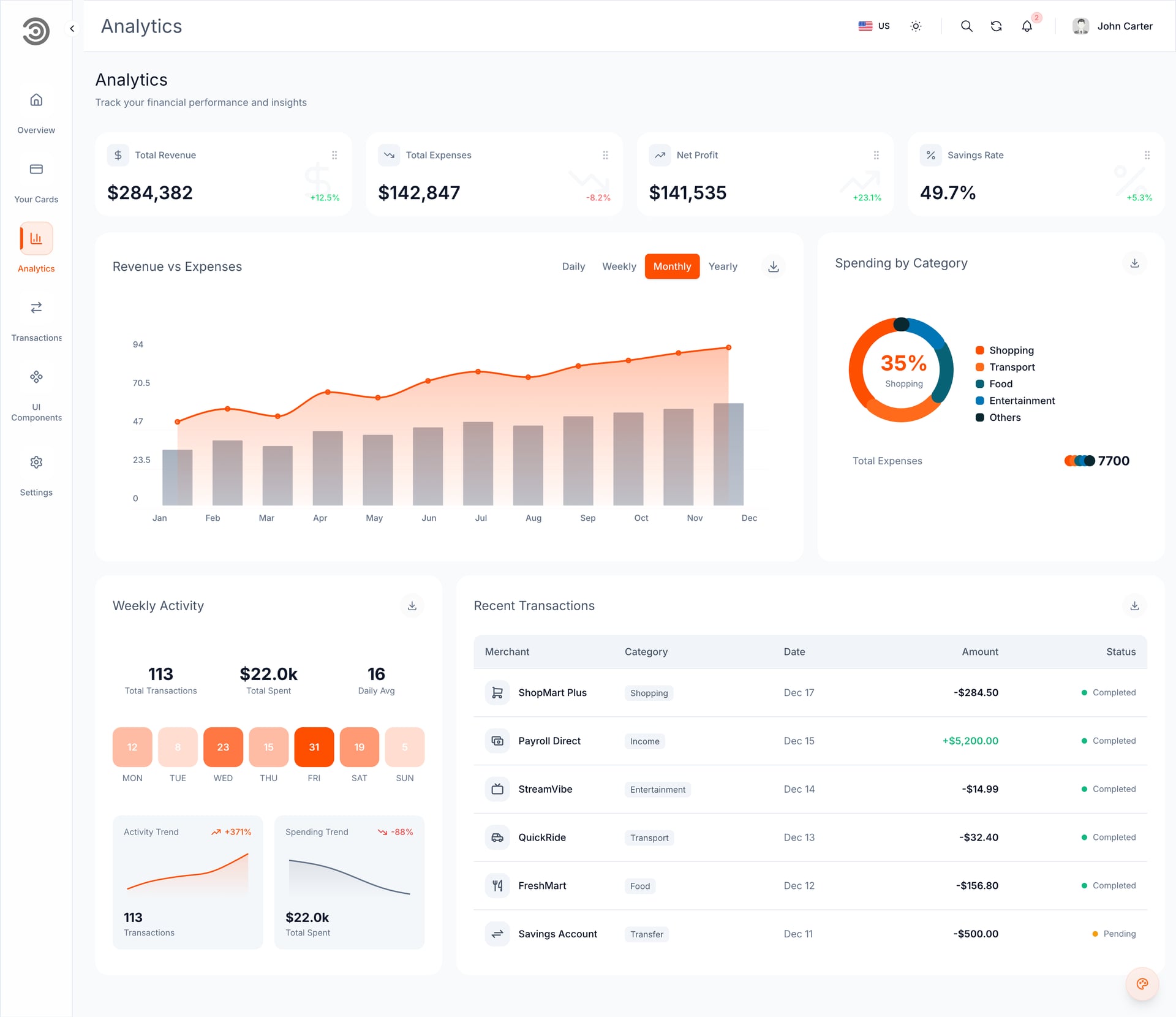
Un dashboard sombre qui ne peut pas devenir clair a été conçu comme une image, pas comme un système. Ici les deux thèmes sont deux valeurs des mêmes tokens, et c'est pourquoi les écrans ci-dessous sont les mêmes composants.
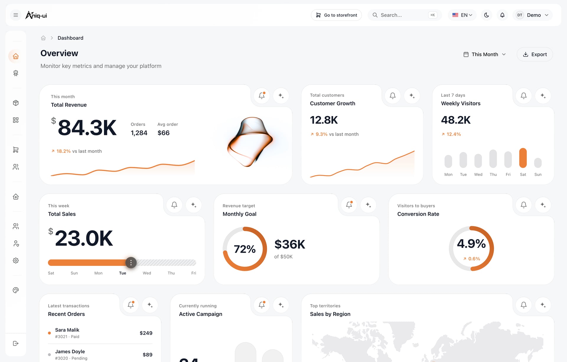
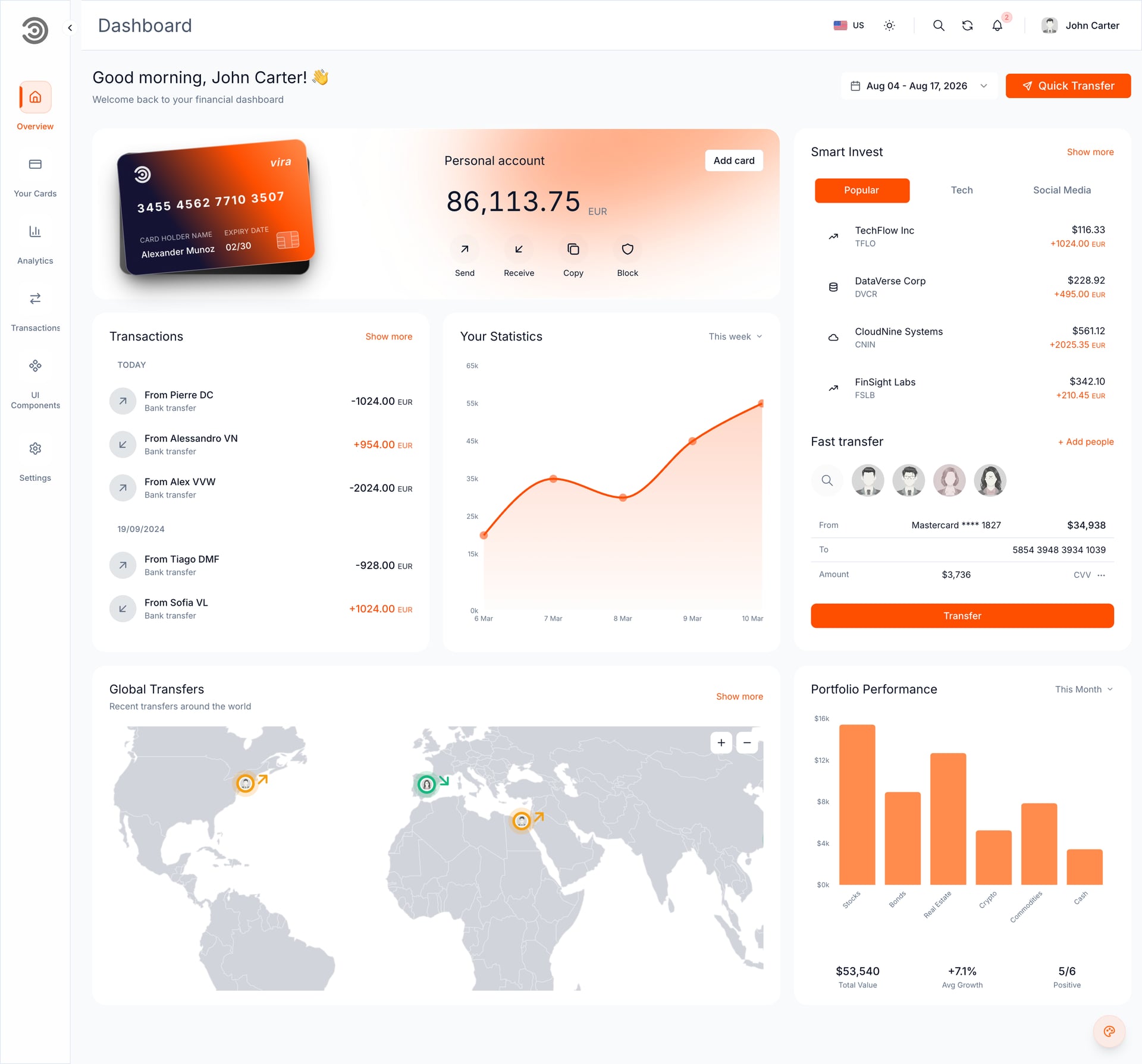
Trois choses changent sur le chemin du clair, et seulement trois : les surfaces inversent leur ordre pour que les cartes se posent sur une page teintée, les accents gagnent en saturation pour tenir contre le blanc, et les ombres reviennent parce qu'elles redeviennent visibles.
Une palette sombre à copier-coller
Chaque écran ci-dessus est une variation de ce jeu. Collez-le dans votre fichier de tokens et le reste est de la mise en page.
| Token | Valeur | Utilisé pour |
|---|---|---|
| background | #0B0E13 | Page |
| surface | #11151C | Cartes, navigation |
| surface-hover | #171C24 | Survol et lignes actives |
| text-primary | #E6E8EB | Titres, valeurs |
| text-secondary | #9AA3AE | Libellés |
| positive | #22C55E | Gains, succès |
| negative | #EF4444 | Pertes, erreurs |
| accent | #60A5FA | Liens, série principale |
Vérifiez chaque paire texte et surface avec WCAG : 4.5:1 pour le corps de texte, 3:1 pour le grand texte et l'UI essentielle. Les thèmes sombres échouent aux tests de contraste plus souvent que les clairs, parce qu'un gris peu contrasté sur du gris paraît élégant jusqu'au moment où quelqu'un le lit en plein jour.
FAQ
Les questions qui reviennent chaque fois qu'une équipe passe un dashboard au sombre.
Quelle couleur de fond pour un dashboard en mode sombre ?
Pas du noir pur. Un gris bleuté très sombre comme #0B0E13 réduit la rémanence sur OLED et permet de construire une échelle d'élévation avec des surfaces plus claires par-dessus. Réservez le noir pur aux lecteurs de médias, pas aux interfaces de données.
Où trouver de vrais exemples de dashboards en mode sombre plutôt que des maquettes ?
Chaque capture et chaque clip de cet article est un produit qui tourne et que vous pouvez ouvrir : l'arrière-boutique e-commerce, le dashboard bancaire et le panneau avec IA ont tous une démo en direct liée sous leurs écrans, et leur code est livré comme templates Next.js. Les maquettes cachent justement ce qui casse : les tableaux, les états vides et les graphiques tiers.
Les dashboards sombres sont-ils vraiment meilleurs pour le travail sur données ?
Ils réduisent l'éblouissement lors des longues sessions et dans les environnements peu éclairés, et ils rendent les données colorées plus visibles. En contrepartie, un texte dense se lit un peu moins vite sur sombre, donc la discipline de contraste compte plus qu'en thème clair.
Quelles couleurs de graphiques fonctionnent le mieux en mode sombre ?
Des séries à saturation modérée avec au moins 3:1 de contraste contre la carte, des grilles à 6 ou 8 pour cent d'opacité blanche, et une seule palette partagée dans tout le produit. Si une couleur de série a besoin d'une légende pour être identifiée, étiquetez la courbe directement.
Faut-il garder le rouge et le vert en mode sombre ?
Oui, parce que les utilisateurs arrivent avec cette association déjà apprise, mais réglez les deux teintes et ne laissez jamais la couleur être le seul indice. Associez chaque rouge et chaque vert à un signe, une icône ou une direction.
Ces templates livrent-ils aussi un mode clair ?
Oui, et depuis le même jeu de tokens plutôt qu'une seconde feuille de style, c'est pourquoi les écrans clairs ci-dessus sont identiques en mise en page. Deux d'entre eux livrent aussi l'arabe avec RTL complet.
Partez d'un template qui le fait déjà
Chaque règle de cet article est implémentée dans trois produits, avec la palette ci-dessus comme fichier de configuration et non comme refonte.
Chacun livre des thèmes sombre et clair, des tokens Tailwind CSS, TypeScript et une démo en direct, pour vérifier les décisions de contraste dans un navigateur avant d'acheter. Le reste de la collection se trouve dans les templates de dashboard et de panneau d'administration Next.js.
Vous pourriez aussi aimer
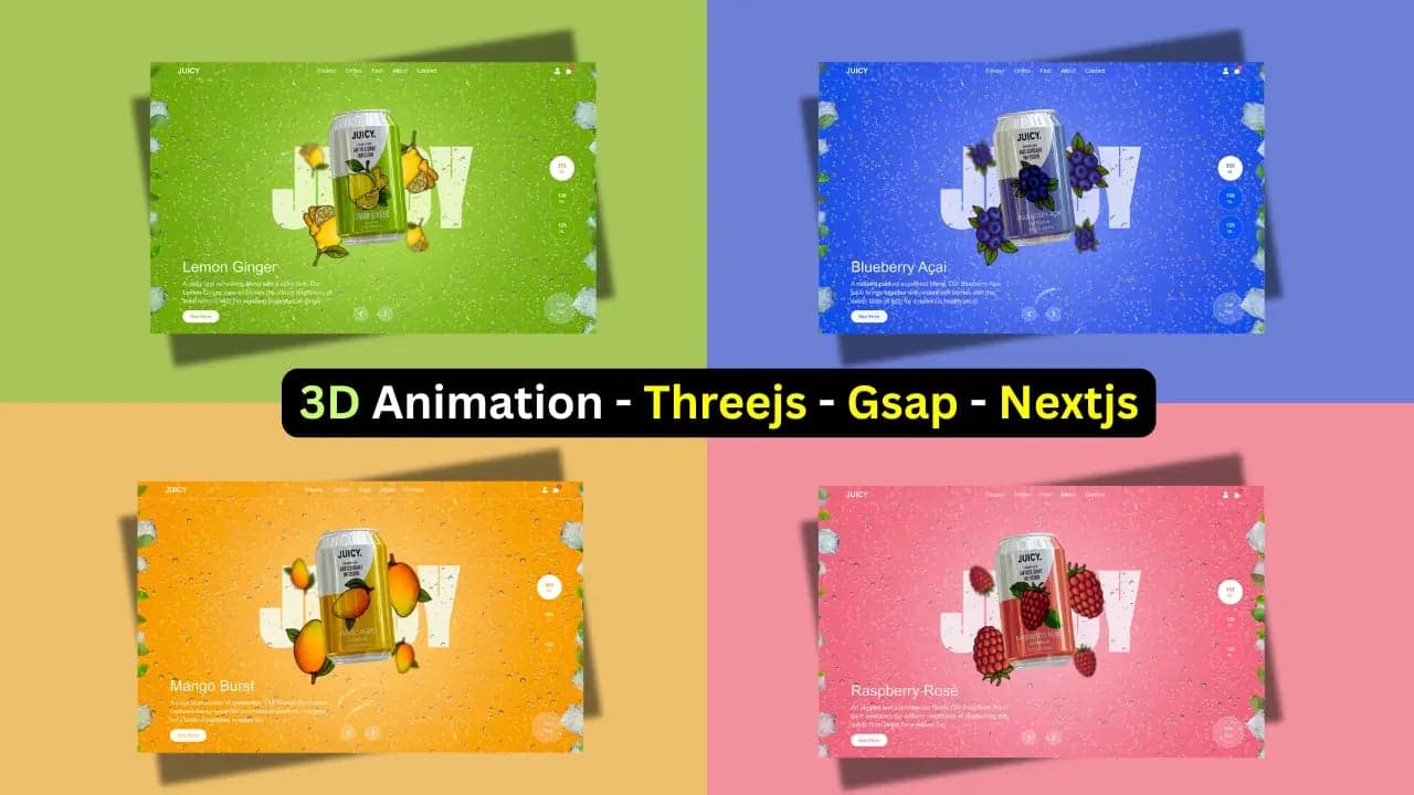
Template gratuit de page d'atterrissage 3D pour sites web de jus, boissons et marketing produit (Next.js + Three.js + GSAP)
Téléchargez un template gratuit de page d'atterrissage animée en 3D construit avec Tailwind CSS, Three.js et Next.js App Router. Parfait pour sites web de produits ou présentations créatives.
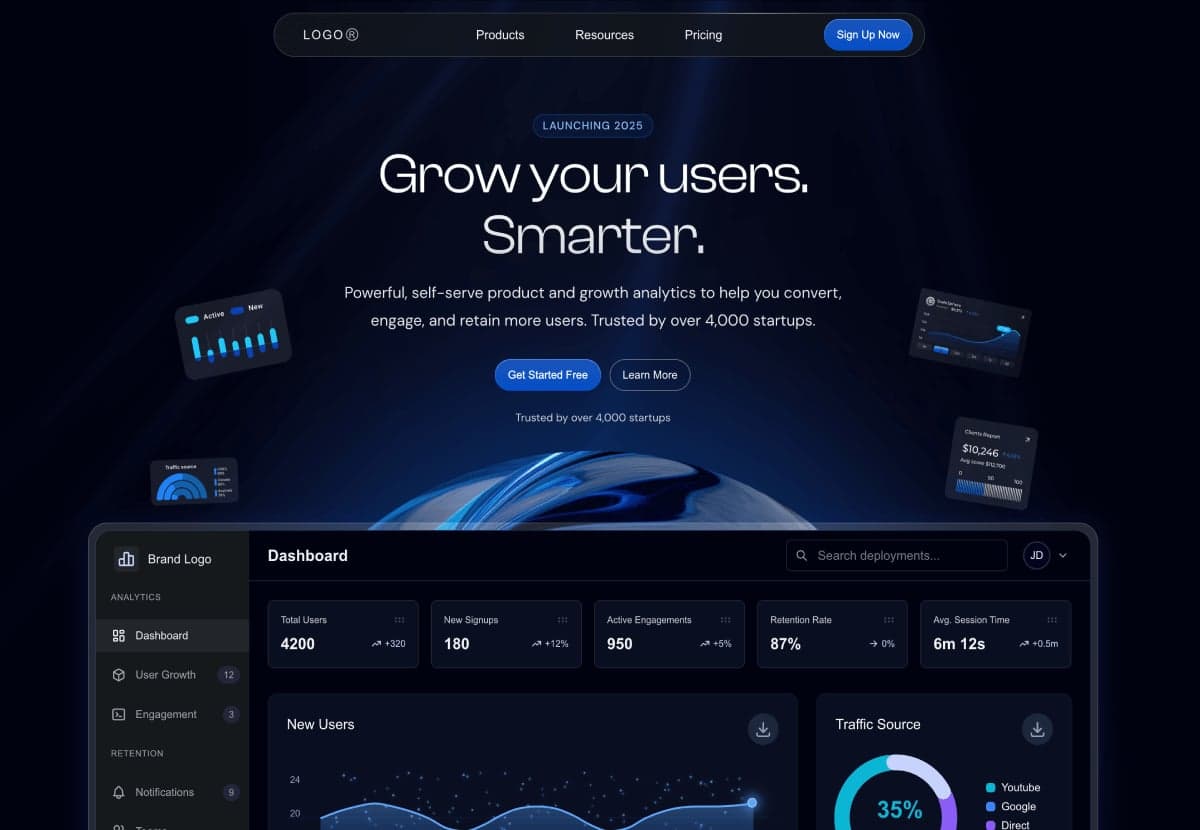
Modèles gratuits de pages d’atterrissage
Découvrez trois modèles gratuits et prêts pour la production, parfaits pour les agences, les sites d'entreprise et les startups SaaS. Conçus avec Next.js 15.2.4 et Tailwind CSS pour des performances ultra-rapides et un design moderne.
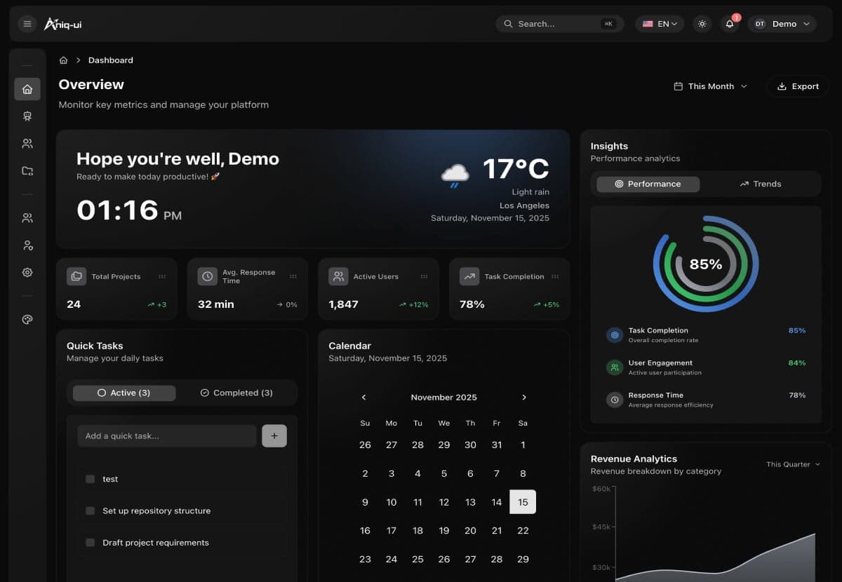
Top 10 des meilleurs templates Next.js Admin Dashboard - 2026
Découvrez les meilleurs templates de dashboard Next.js pour 2026. Solutions open-source gratuites et templates premium avec des fonctionnalités avancées.
